Notes on design & craft
Practical writing on UI/UX design, usability, product thinking, and the workflow that carries ideas from Figma to production.
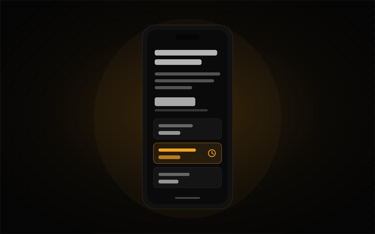
Usability Testing When the Reader Is Scared
Some interfaces get read on a phone at midnight by someone in the middle of a family crisis. A calm participant in a quiet room will sail through a test that a frightened reader would fail. How I'd test a site like that without staging anyone's distress, using a healthcare navigation practice I designed for as the example.
Read article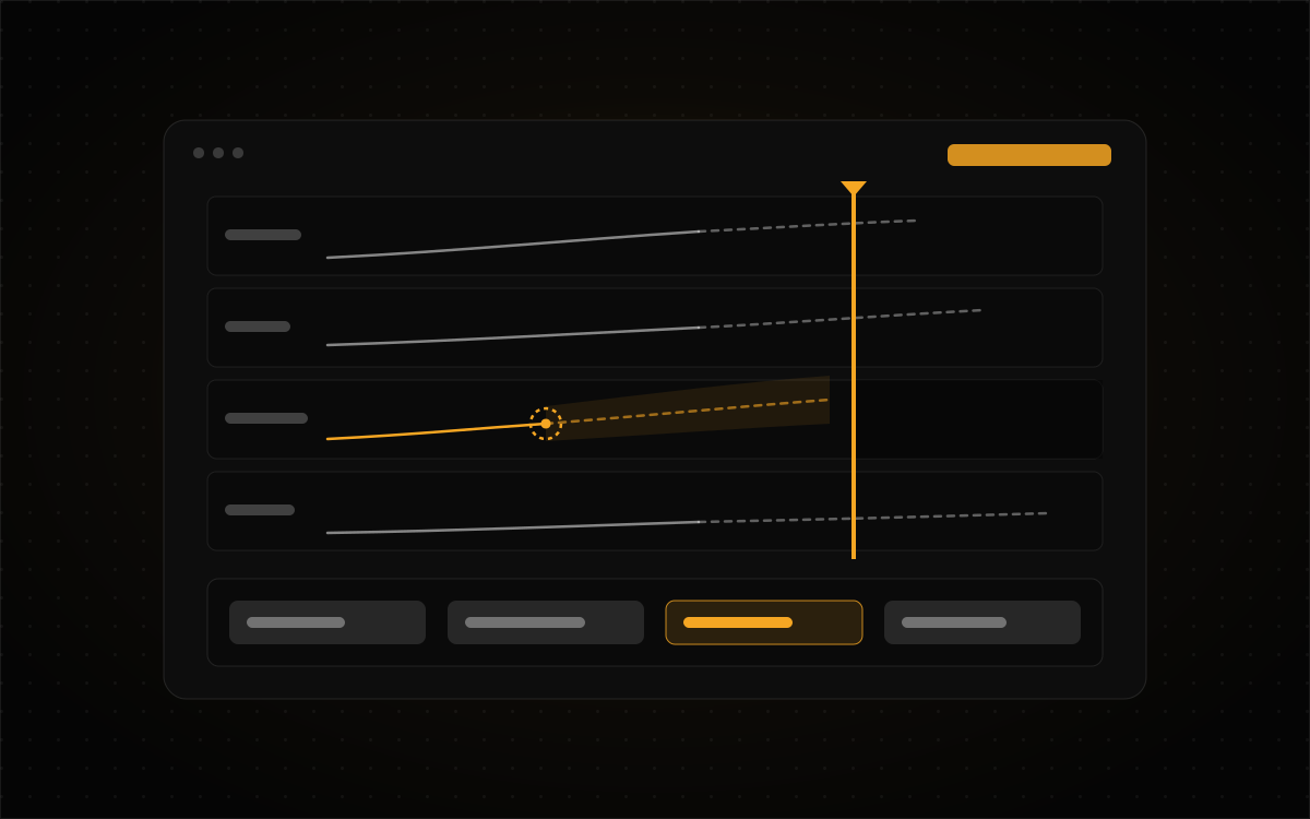
Test the Decision, Not the Dashboard: Usability Testing for Expert, Time-Pressured Interfaces
"Find the conjunction list" is a task almost any operator will pass, on an interface that can still get them to the wrong answer. For tools where people decide under a deadline, the thing to test is the decision. Here's how I'd write that test plan, using two consoles I designed where the deadline is the whole design problem.
Read article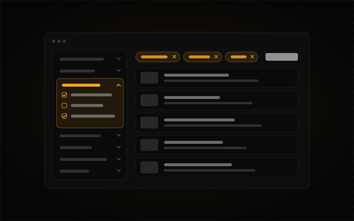
130 Filters and Nobody Got Lost: Progressive Disclosure on Data-Dense Platforms
A product with 130 filters doesn't need fewer filters. It needs a better answer to the question of what shows up first. How I approach depth on data-heavy platforms like PropertyReach and PropStream, and the two cheap tests I'd run before drawing a single pixel of it.
Read article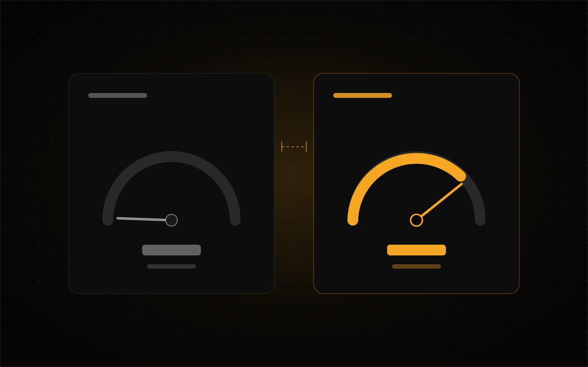
Measured, Not Assumed: Five Times the Obvious Answer Was Wrong
A build report that said a feature cost nothing. A contrast fix that made contrast worse. An analytics dashboard full of leads that turned out to be me. Five stories from building this site, and the slightly suspicious habit that fixed every one of them.
Read article
The Guardrails Are the Product: A Portfolio Chatbot That Can't Invent a Price
Getting a chatbot onto my portfolio took an afternoon. Stopping it from inventing prices, email addresses and start dates took a lot longer. Here's how the assistant on this site is built so its rules are enforced in code, plus the two rules that flipped when I copied it from another project.
Read article
A Dashboard That Refuses to Look Good: Designing Finance UI for Doubt
Most finance dashboards are built to make you feel good. I designed one to make me suspicious, in the right order. What I learned building the operator screen for a one-person trading system, including the three bugs a simulator politely hid from me.
Read article
The Wrong Field on Your Persona: Designing for Every Education Level
Almost every persona I've been handed says something like "Education: Bachelor's degree." It looks like research, and it has never once changed a design. Education is really standing in for four different things: reading proficiency, domain knowledge, digital confidence, and how much someone has left in the tank that day. Each one asks something different of the design.
Read article
Why Hire Damien Komala
Every designer's "why hire me" page says the same three things: passionate, detail-oriented, collaborative. You can't check any of them. This is the version with receipts: 27 years, 300+ hand-coded websites, eleven roles across SaaS, fintech, e-commerce and enterprise, and what all of that gets you on a Tuesday afternoon three weeks into a project.
Read article
Nobody Is Auto-Rejecting Your Resume
The "75% of resumes get rejected by a robot" statistic traces back to a 2012 sales pitch from a company that shut down in 2013. I put twenty sources into a notebook to find out what actually holds up, and ended up with a 42-minute podcast that argues both sides.
Read article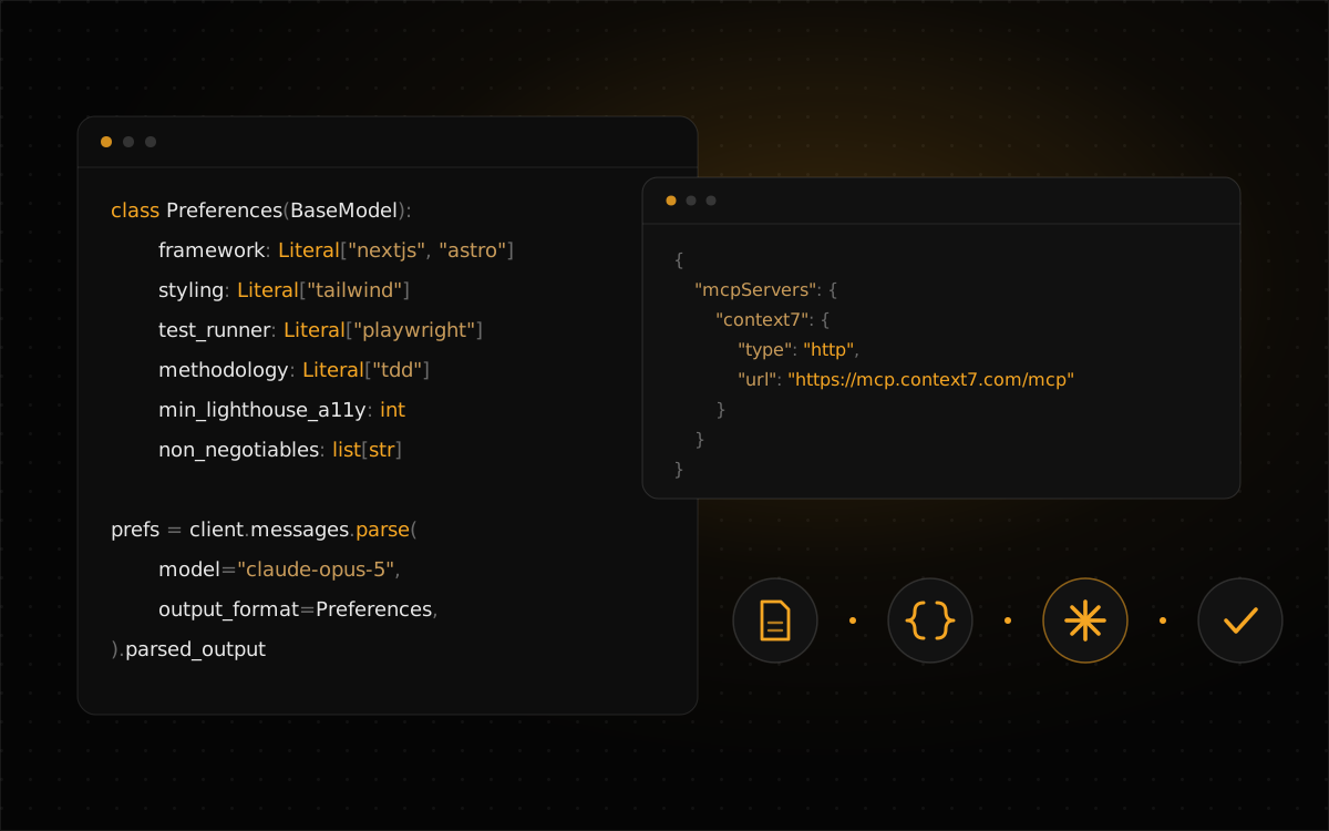
Building a Claude Code Support Agent: Pydantic, Context7, and a Finished PRD
Most AI coding assistants answer from vibes and stale training data. Here's how I wire a Claude Code support agent, plus a second agent that checks its work, to the decisions my PRD already made, with Pydantic holding the contract and Context7 supplying current docs.
Read article
Prompting AI Design Tools Like a Product Designer
The gap between designers who get real leverage from AI design tools and those who get generic output comes down to how the prompt is written.…
Read article
Design and Code Drift Apart by Default: Structuring Figma So They Don't
Figma and the codebase don't drift apart because people are careless. They drift because nothing is holding them together. Here's how I set up tokens, components and patterns for fintech and real estate products so design and code stay in step, and what I do when a screen needs something the system never planned for.
Read article
Connecting Claude to WordPress via MCP: Setup and Essential Plugins
The Model Context Protocol (MCP) is an open standard from Anthropic that lets an AI assistant like Claude connect directly to external tools and data sources instead of just generating text you copy and paste. For WordPress, that means Claude can create posts, manage media, update navigation, and handle routine site operations through conversation rather…
Read article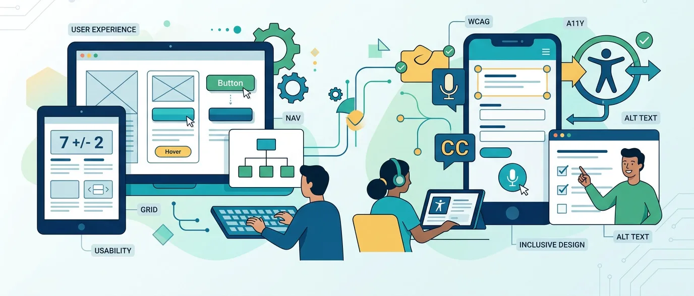
12 Industry-Standard Usability Principles
Creating a great user experience is more than making an interface look attractive. It means helping people complete tasks easily, confidently, and with minimal friction. In UX, usability principles are the foundation for designing products that are effective, efficient, accessible, and easy to learn. Below are 12 widely recognized usability principles that UX designers use…
Read article
From UX Feedback to Better Products
A great digital product is rarely the result of one brilliant design idea. More often, it’s built through a cycle of listening, testing, refining, and communicating clearly across teams. The best UI and UX products come from organizations that know how to gather meaningful user feedback, turn that feedback into action, and align designers and…
Read article
Understanding UX Personas
Designing great products starts with understanding the people who will use them. UX personas are fictitious, yet research-driven representations of your target users that help teams keep real users at the center of decision-making. When combined with user-centered UI design practices, personas become a powerful tool to align stakeholders, validate design choices, and create interfaces…
Read article
From Design to Dev
A beautiful Figma file means nothing if it can’t be built cleanly. The handoff from design to development is where great products either stay great—or slowly unravel. Missing specs, unnamed layers, mystery components, and “we’ll explain it later” notes are the fastest way to introduce bugs, delays, and frustration on both sides. This guide walks…
Read article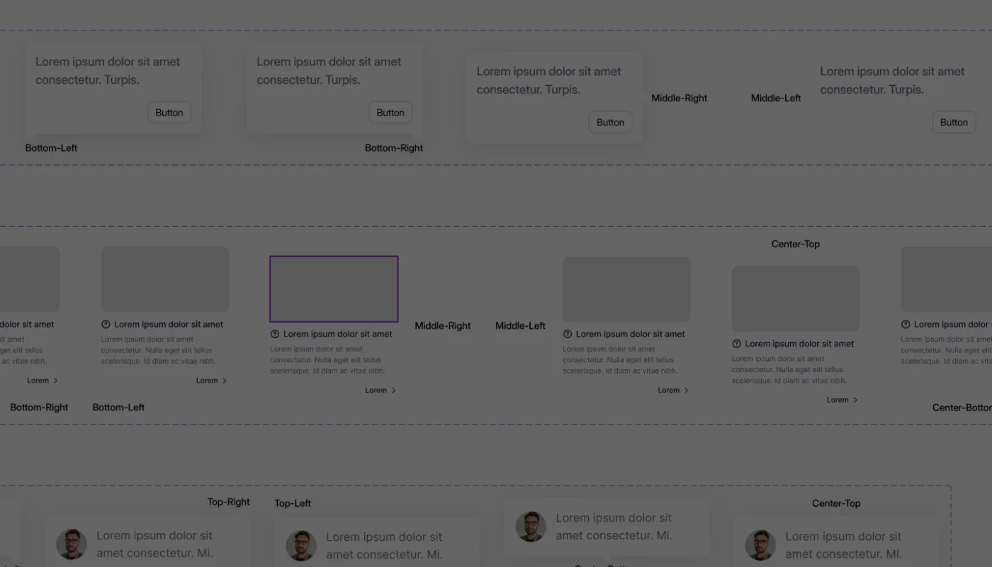
Microcopy That Converts
In the world of digital design, it’s often the smallest words that make the biggest impact. The right phrase on a button, tooltip, or error message can guide users, build trust, and even turn hesitation into conversion. This is the art of microcopy — those short, strategic bits of text that live inside your interface…
Read article
The Future is Motion
Animation has become an essential part of modern user experience design. From subtle microinteractions to sweeping transitions, motion gives life to interfaces, guiding users and reinforcing meaning. But there’s a delicate balance: animation should enhance usability, not become a distraction—or worse, a bottleneck that slows people down. In this article, we’ll explore how to use…
Read article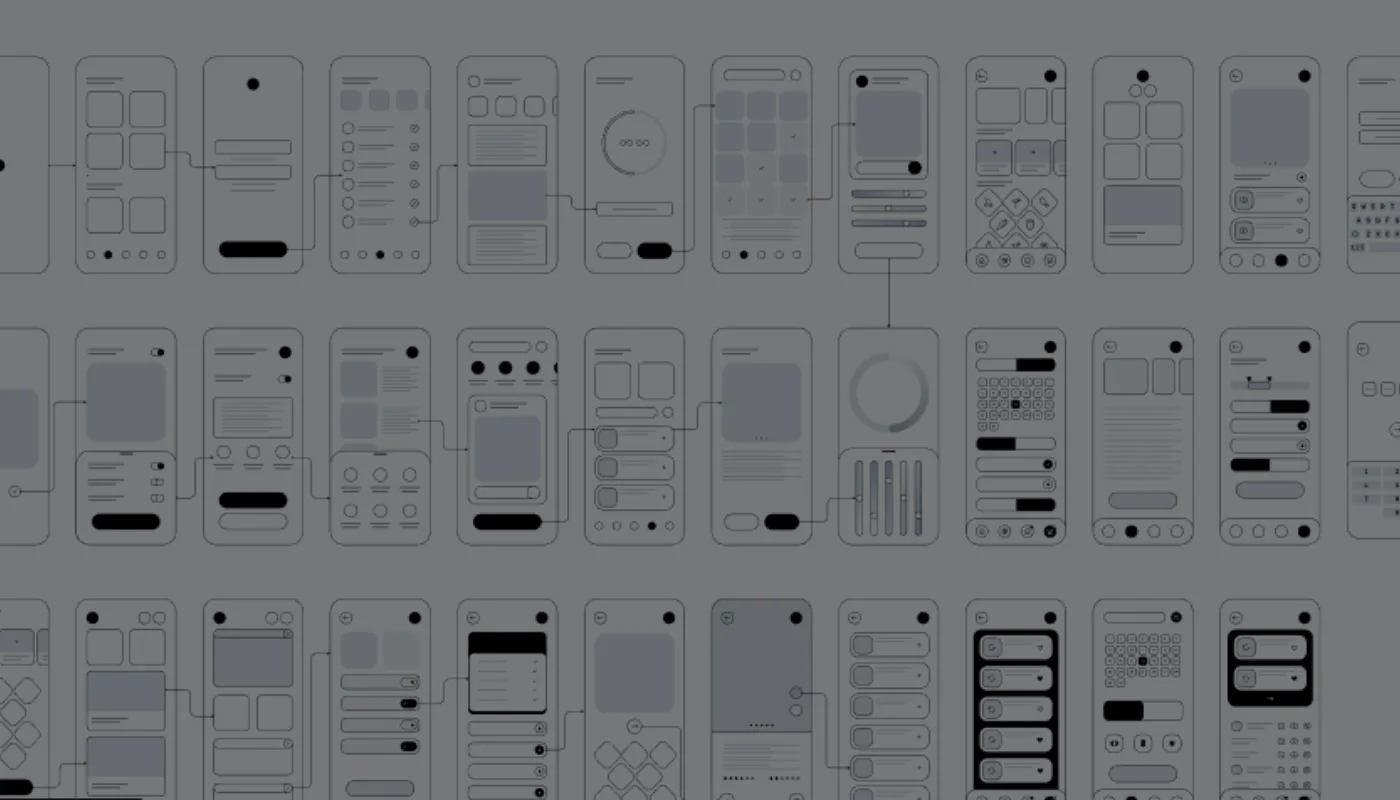
Beyond Pretty
A beautiful interface can grab attention, but looks alone don’t guarantee usability. A truly successful UI is one that enables users to achieve their goals quickly, intuitively, and with minimal frustration. To measure whether your design is working, you need to go beyond aesthetics and focus on key performance indicators (KPIs) that reflect real user…
Read article
The 5-Second Rule in UI Design
When a user lands on your website or app, you only have a few seconds to grab their attention. In fact, studies show that people form an impression of a digital product within the first 5 seconds of interacting with it. This makes the “5-second rule” a crucial principle in UI design—if you can’t engage…
Read article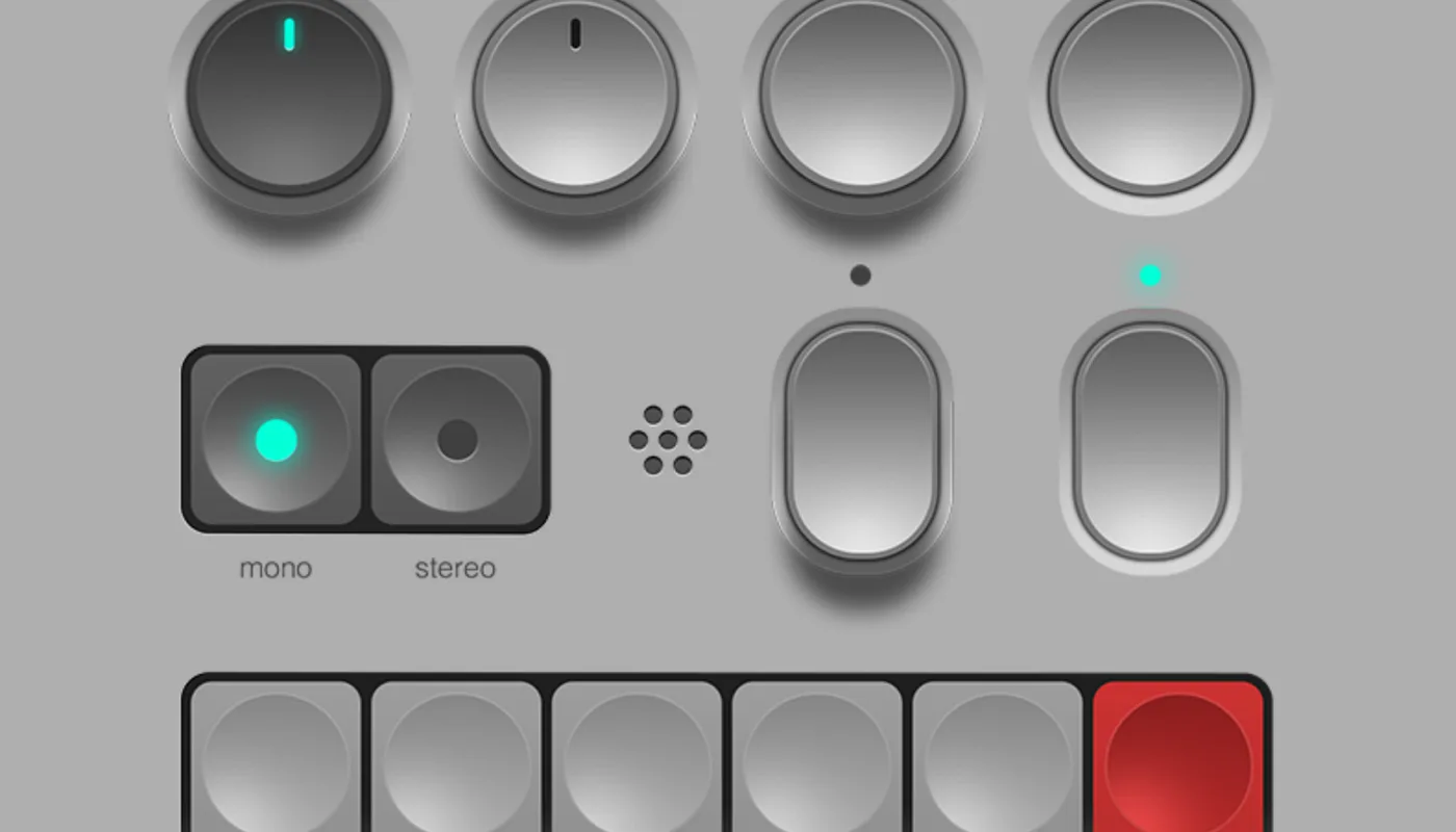
From Skeuomorphism to Neumorphism
Design isn’t just about how things look—it’s about how they feel, how they guide us, and how they evolve alongside technology. Nowhere is that more evident than in the history of user interface (UI) design. Over the past few decades, we’ve witnessed dramatic shifts in visual language, each one reflecting changes in technology, culture, and…
Read article
The Psychology of Color
Red – Energy & Urgency Emotional Response: Passion, excitement, urgency, danger, love. Usage in Design: Great for calls to action (CTAs), sales promotions, and attention-grabbing elements. Caution: Overuse can induce anxiety or aggression. Orange – Enthusiasm & Confidence Emotional Response: Cheerful, creative, friendly, enthusiastic. Usage in Design: Appeals to a younger audience; used in marketing…
Read article
Designing for Thumbs
We live in a mobile-first world—and for most users, their thumb is the primary navigation tool. Whether they’re scrolling through social media, tapping “buy now,” or swiping to unlock, the design of your mobile UI must work with the thumb, not against it. Good thumb-friendly design reduces effort, speeds up interaction, and feels intuitive. Let’s…
Read article
Dark Mode Done Right
Dark mode has moved from being a novelty to a user expectation. But implementing it isn’t as simple as flipping your light palette into its darker twin. Done well, dark mode can reduce eye strain, save battery life on OLED screens, and give your product a sleek, modern aesthetic. Done poorly, it can create accessibility…
Read article
Figma Power Moves
Figma is a robust UI/UX design tool that, when leveraged to its full potential, can dramatically speed up your workflow and boost productivity. Below, you’ll find a range of “power moves” and pro tips designed to help you work smarter, not harder, whether you’re managing a personal project or coordinating with a team. 1. Master…
Read article
Mobile vs. Desktop UX
Today’s users don’t live on just one screen. They start reading on a laptop, browse again on mobile, and maybe finish the task on a tablet. Designing for both mobile and desktop isn’t just about resizing screens—it’s about understanding context, behavior, and intent. So how do we create experiences that feel seamless across platforms? 1.…
Read article
My Full UI/UX Process on a Real Project
Taking a UI/UX project from a rough idea to a polished, live experience isn’t just about making things look pretty—it’s about solving real problems with real users in mind. In this post, I’ll walk you through my full UI/UX process on a real project, from early wireframes to the final polished product. 1. Understanding the…
Read article
Designing for All Users
Accessibility isn’t a checklist. It’s a mindset—a commitment to making digital experiences usable for everyone, regardless of ability. Yet too often, accessibility is treated as an afterthought. The truth is simple: Accessible design is good design. Inaccessible design is broken design. Let’s explore why accessibility matters, what it really means, and how to build it…
Read article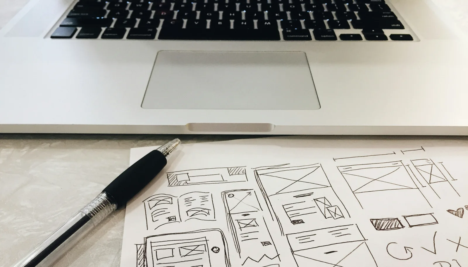
How UI Can Build Trust, Joy, and Loyalty
Behind every tap, scroll, and click is a human being—with feelings. As designers, we’re not just shaping interfaces—we’re shaping emotions. When we design for emotion intentionally, we create experiences that people don’t just use—but remember, return to, and recommend. Let’s explore how great UI design can inspire trust, spark joy, and foster long-term loyalty. 1.…
Read article
Top 10 UI/UX Mistakes Designers Still Make
Even the most experienced designers fall into common UX traps. Whether due to time pressure, stakeholder demands, or habit, these mistakes can cost users time, trust, and patience. Here are 10 UI/UX missteps that still show up far too often—and how to fix them. Overcomplicating the Interface Mistake: Trying to cram too much information or…
Read articleHow UI/UX Design Shapes Human Behavior
In a world increasingly mediated by screens and software, the influence of UI (User Interface) and UX (User Experience) design on human behavior is profound—and often invisible. Every click, swipe, or scroll is a result of intentional design choices. These choices can empower users and enhance lives—or manipulate attention, deepen addiction, and exploit cognitive biases.…
Read article
UI/UX Design Can Change the World
UI/UX design can change the world not just by making things look better—but by reshaping how humans interact with technology, information, and even each other. Here’s how: Empowering Access for All Good design removes barriers. Accessible UI/UX helps people with disabilities navigate digital spaces, whether it’s through screen reader compatibility, intuitive layouts, or voice-driven interfaces.…
Read article
Improving a Bad Interface in 3 Steps
We’ve all been there: staring at a cluttered, confusing, or outdated interface thinking, “How did this even get built?” Instead of mocking bad UX, let’s fix it. Here’s a simple, powerful 3-step process to transform a broken interface into a clean, intuitive experience—without starting from scratch. Step 1: Diagnose the Problems Before redesigning anything, you…
Read article
The Subtle Details That Make Your UX Sing
In UX design, we often focus on big-picture elements—user flows, navigation, screen layouts. But it’s the small moments that can make an experience feel magical. Those tiny touches? They’re called microinteractions—and they’re what transform a usable product into a delightful one. What Are Microinteractions? Microinteractions are small, contained product moments that accomplish a single task.…
Read article
Specifying personas in UI/UX design
Specifying personas in UI/UX design is critically important because it ensures the product is built with a clear understanding of the target users’ needs, goals, behaviors, and pain points. Here’s a breakdown of why personas matter so much in UI/UX design: User-Centered Design Personas anchor design decisions in real user needs rather than assumptions. They…
Read article
The Psychology Behind Great UX
Good UX doesn’t just feel nice—it feels right. That’s because it aligns with how our brains work. Behind every “that was easy” moment is a blend of psychology, neuroscience, and smart design choices that reduce friction and increase satisfaction. Let’s explore the psychological principles that make great UX so irresistible. 1. Cognitive Ease: Make It…
Read article