Usability Testing When the Reader Is Scared
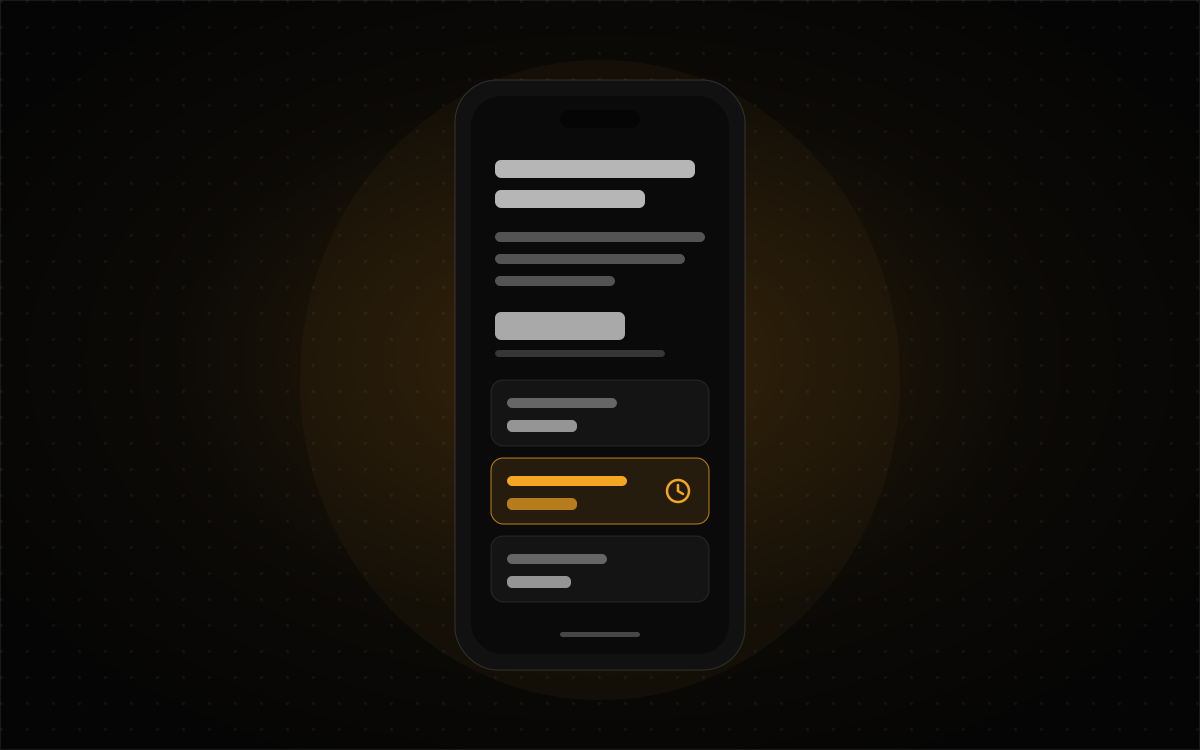
Most usability sessions happen in the calmest conditions a product will ever see. The participant is rested, focused, getting paid a gift card, and sitting in front of a nice monitor with a friendly moderator nearby. For a lot of products that's close enough. For some it's nowhere near.
Guided Health Navigation is a site for an independent healthcare navigator in Orange County, who helps families through appeals, coverage, and the paperwork around a parent's care. The people reading it are older adults and adult children in the middle of something hard. Often they're on a phone, late at night, after a phone call that went badly. That's the real test environment. It's also one you'd never want to recreate on purpose.
The interface here isn't complicated in the usual sense. It has six marketing pages, not 130 filters. The complexity comes from two other directions: the reader's state of mind, and a compliance memo that controls what the site's allowed to say. Both change what a good test looks like.
Stress narrows the page
When someone's anxious, they don't read your page. They hunt it. Attention narrows to "does this answer my question, and what does it cost?" Anything that isn't that is skipped, including the reassuring paragraph you spent a week on.
A lot of the design choices on this site come from that. Every rate is published in full, with its unit right under the figure, because a price you have to call to get is a price a frightened reader assumes is bad news. The free 30-minute phone consultation sits at the top of the rate list, not in a banner, with the sentence that if you don't need her, she'll tell you. The body text never drops below 18px. And there's exactly one accent-colored card on the services page, for the Medi-Cal renewal review, because it's the only engagement with a deadline attached. The color means "clock," so it can't be spent on anything else.
Those are good intentions. A calm lab session won't tell you whether they hold up for someone who's barely reading.
Never stage the distress. Simulate the context.
I want to be clear about the line here. You don't make participants anxious to see how your interface copes. You don't ask them to imagine their mother's in hospital, and you don't recruit people mid-crisis because their reactions would be "authentic." That's not research. That's harm with a consent form.
What you can do is recreate the conditions stress causes, which are mostly about attention, time, and physical setup:
Their own phone, their own settings. Test on the participant's device with their text size and brightness as they really are. A lot of older readers have system text bumped up, and that alone will find layout problems your design files never showed you.
A short, honest time limit. "You have two minutes to find out what the first conversation costs." It's a small amount of pressure that mimics narrowed attention without asking anyone to feel anything.
Low light and one hand. Dim the room and ask them to hold something in the other hand. The site has a dark mode because so much of this reading happens at night, and this is the cheapest way to check whether the dark theme is actually readable at 1am brightness, not just at design-review brightness.
An easy way out. Some topics, like aging parents, care costs, or appeals, will land close to home for some participants no matter how neutral the task is. Say up front that they can skip any task or stop, and mean it. Have the moderator watch for it.
Test whether the careful wording still lands
This is the part that's unique to regulated sites, and the reason I think they need their own testing approach. The site is held to some strict rules. It never claims outcomes for the practice's own clients, because no outcome research exists for solo advisory practices. Every statistic carries a public source, printed right under the figure. The navigator's employer is never named or implied. And the services page says "I advise. You act." above the rates, because the person paying has to understand that she advises and the family makes the moves.
Every one of those rules makes the copy more careful. Careful copy can also turn vague, and vague copy fails stressed readers first. So the test has to check that compliant wording still gets understood, not just that it's compliant. Two methods I'd lean on:
A five-second test on the rates. Show the pricing section for five seconds, hide it, and ask: "What does the first conversation cost? What happens if you need more help?" If people walk away thinking it's all free, or can't recall any number, the unit labels and order aren't doing their job.
A comprehension check on the boundaries. After someone reads the "I advise. You act." section, ask them in their own words: "If you hire her, who files the appeal?" If the answer is "she does," the copy has failed in exactly the way a compliance review can't see. It's accurate and it's misunderstood. That's worth knowing before a family finds out the hard way.
Accessibility is something you test with people, too
The site's color pairs were measured in both themes, and contrast checkers are essential. But a checker can't tell you whether a 72-year-old with mild cataracts can find the phone number on a dim screen, or whether the source line under a statistic reads as useful context or as legal fine print to skip. Recruit some participants who actually use larger system text, a screen reader, or zoom, and give them the same tasks as everyone else. If they need a separate easier task list, that's a finding in itself.
Where personas stop and testing starts
A while back I wrote about why "Education: Bachelor's degree" is the wrong field on a persona, and how reading proficiency, domain knowledge, digital confidence, and how much someone has left in the tank are what really shape a design. This post is the other half of that one. A persona tells you who's reading. A test like this tells you whether the page still works when that reader has almost nothing left in the tank.
I'm writing this as a method rather than a write-up of sessions I ran. It's how I'd test this site, and any site read by people on the worst night of their month. You can see the decisions it would be testing on the Guided Health Navigation case study. If you're building something for readers who are scared, tired, or in a hurry, I'd love to help make sure it holds up. Get in touch.