130 Filters and Nobody Got Lost: Progressive Disclosure on Data-Dense Platforms
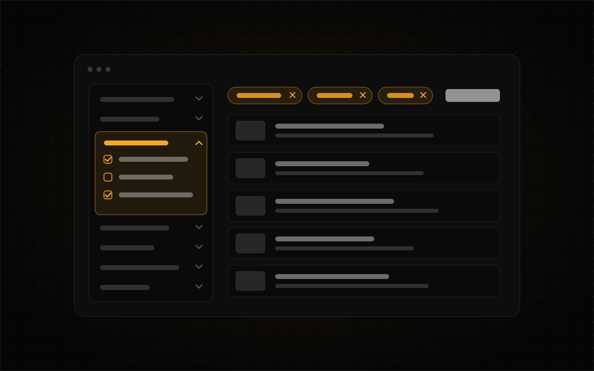
Every so often someone looks at a data-heavy product and says the thing everyone thinks: "There's just too much here. Can we cut it down?" It's a fair instinct, and it's usually wrong. On a platform like PropertyReach, which puts records for 160 million properties behind more than 130 filters, the filters are the product. An investor hunting for a tax-delinquent, high-equity, absentee-owned duplex in one zip code needs every one of those criteria. Take them away and you haven't simplified anything. You've just made the product useless to the person paying for it.
So the design question isn't "how much do we remove?" It's "what shows up first, what waits until it's asked for, and how does somebody find the thing that's waiting?" That's progressive disclosure. It sounds tidy in a textbook and gets very messy the moment you have a real taxonomy in front of you.
Complex isn't the same as cluttered
Clutter is when everything shouts at the same volume. Complexity is just a lot of things. You can have a huge amount of capability on a screen that still feels calm, as long as the order is clear: one obvious place to start, a predictable place to go deeper, and a constant answer to "what am I looking at right now?"
PropertyReach opens on a single search box. Not a filter wall, not a dashboard of 40 widgets. You type an address, an owner, or an area, and the product splits into a map and a list kept in sync. Everything else is one step further in, and you only take that step when you have a reason to.
Four moves that do most of the work
Give beginners a door that isn't a form. The quick lists (pre-foreclosures, high equity, vacant, tax delinquent) sit one click from the dashboard. A first-timer gets a useful result before touching a single filter. That matters more than it sounds. Someone's first ten minutes decide whether the product feels powerful or hostile, and a blank filter panel with 130 options feels hostile.
Group by the user's mental model, not the database schema. The 130+ criteria live in a left rail grouped by owner info, property characteristics, MLS, liens, value, and mortgage. That grouping is the one decision you can't fix later with nicer styling. If the categories match how investors think about a deal, people drill straight to what they need. If they match how the data happens to be stored, people scroll, guess, and give up.
Always show the state you've built. Every active filter shows up as a removable chip next to a live result count. Once someone has stacked eight criteria, the real risk isn't finding a filter. It's forgetting one they set twenty minutes ago and wondering why the results look thin. The chip row is the product saying out loud, "here's exactly what you asked for."
Let experts skip the staircase. Saved searches and custom quick filters let a repeat user rebuild a complicated query in one click and rerun it as new records come in. Progressive disclosure that never lets you skip ahead stops being helpful and turns into a toll booth.
The same data, two different jobs
PropStream is a good reminder that "how much to show" depends on the moment as much as the user. The web app is built for volume: a whole market's distress data, monitored lists that update themselves, campaigns going out to thousands of addresses. The field app is built for speed in front of one house. Same records, same customers, completely different disclosure strategy. At a desk you can afford a rail of filter groups. Standing on a sidewalk, you want the three facts that tell you whether to knock on the door.
If your product has a "power" mode and a "quick" mode, ask whether that's really about two kinds of people, or one person in two situations. Usually it's the second, and that changes what you test.
Test the structure before you style it
Here's the part I think teams skip most often. Whether the filter taxonomy works is the riskiest question on a screen like this, and you can answer it before any visual design exists. I'm writing this as a method, not a report. These are the tests I'd run on any taxonomy this size, and the order I'd run them in.
A tree test first. Strip the interface down to just the category labels and the filters inside them, as plain text. Give participants realistic tasks ("find properties where the owner has lived there more than ten years") and watch where they look. No colors, no icons, no layout to lean on. If people can't find "years owned" from the labels alone, no amount of polish will save it. Tree tests are cheap, quick, and work remotely with a free tool and a spreadsheet of tasks.
Then a first-click test on a rough layout. Once the groups hold up, put them in a grayscale wireframe and ask where people would click first for each task. First clicks are a surprisingly strong predictor. When someone's first click is right, they usually finish the task. When it's wrong, they often never recover. Thirty seconds per task tells you more than an hour of debate about rail versus top bar.
Two cohorts, never one. Run novices and experienced users separately and read their results separately. They fail in opposite directions. Newcomers get lost in the vocabulary (what's the difference between "pre-foreclosure" and "lis pendens"?). Experts get irritated by anything that slows down a query they've built a hundred times. Blend the two groups into one success rate and both problems vanish into an average that looks fine.
Add a "state" task. Halfway through a session, ask the participant to tell you, without changing anything, every filter currently active. It's a little unfair, which is the point. If they can't answer it, your applied-filters summary isn't doing its job, and a real user is about to make a decision based on a list they don't fully understand.
A checklist for any screen with more than 20 controls
When a screen gets dense, I run it through these five questions before anyone argues about removing things:
- Can a first-time user get a useful result without touching a single control?
- Do the group labels match how the user describes the task, or how the data is stored?
- Can someone tell you, at a glance, every setting they currently have applied?
- Can a returning expert skip straight to their usual query?
- Have you tested the structure with plain text before testing it with pixels?
If the answer to all five is yes, you probably don't have a clutter problem. You have a complex product that's doing its job, and the honest move is to leave the depth in and keep making the doors to it better.
You can see how the filter rail, chips, and quick lists came together on the PropertyReach case study, with the desk-versus-field contrast on PropStream. If you're staring at a product with more settings than anyone can hold in their head, I'd be happy to help sort it out. Get in touch.