A Dashboard That Refuses to Look Good: Designing Finance UI for Doubt
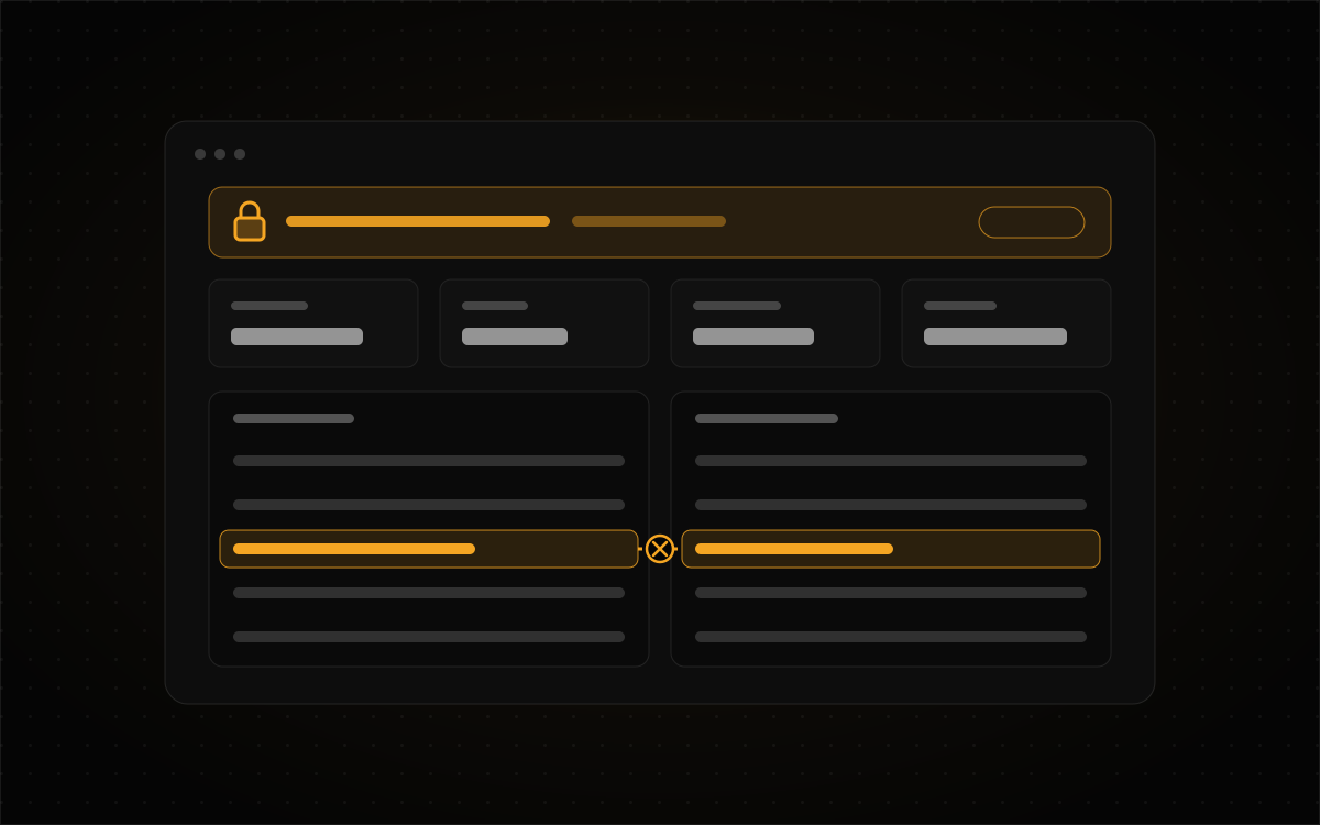
Open almost any finance app and it wants you to feel great. There's a big green number at the top, a smooth upward curve, and a percentage sitting in a rounded card like it just got a promotion. That's fine when you're checking your savings account. It's a problem on a screen you actually make decisions from, because the dangerous number isn't the one that looks wrong. It's the one that looks completely fine and isn't.
I've spent the last few months designing and building the operator dashboard for Rockwell Investor Software, a personal project. It's a single-user algorithmic trading system for a small cash account, and its spec is a two-volume manuscript I wrote first (yes, I wrote two volumes before I let myself draw a button). The dashboard is twenty pages, sorted by when you'd use them: before the open, during the session, and after the close. You can poke around the live version. It runs on generated data, it's read-only, and it tells you so on every single page.
My brief to myself was backwards from most finance work. The screen shouldn't try to make the numbers look good. It should help me decide whether to believe them.
Doubt things in the right order
Every figure on the overview (equity, P&L, drawdown, settled cash) comes from the system's own record of the account. If that record disagrees with the broker's, every number below it is wrong, and wrong in the sneakiest way: it still looks right. So the page asks its questions in order. First, does my record match the broker's? Then, what does my record say? And only after that, is any of this actually working?
That's why reconciliation sits at the very top of the overview and the live session view, above the P&L. You can't hide it, either. Every other panel can be rearranged or switched off in settings, but reconciliation wears a little locked "cannot be hidden" tag, and the API rejects any layout that tries to leave it out.
I know that sounds bossy for a dashboard I'm the only user of. But I know myself. If there's a toggle to hide the boring warning banner, I'll eventually hide it, and I'll do it on exactly the morning it mattered. When a check is load-bearing, I'd rather make removing it impossible than trust future me to be disciplined about it.
Two books, side by side, never merged
The positions page shows the system's book next to the broker's, and each symbol gets an agree or disagree status. A single merged table would look tidier. It's also exactly where a discrepancy would quietly vanish, because merging two sources means deciding which one to believe. I want a person making that call while looking at both, not a join statement making it at 3am.
This turned into a habit across the whole project. When two sources might disagree, I show both and show the disagreement, even when it makes the screen messier.
A trade ticket that doesn't actually send anything
The system isn't allowed to trade on its own. A strategy has to earn autonomy, and a person (me) confirms every order. So the trade ticket is really a record that can become an instruction, if I sign off on it.
It checks your limits while you type, using the same rules the confirmation step will use, so if something's going to be refused you find out before anything gets written down. It also makes you give a reason, and you can't skip that field. That felt fussy at first. Then I imagined myself three weeks from now, staring at a position I don't remember opening, and suddenly the reason field was my favorite feature.
Refused tickets stay in the book too, along with the rule that stopped them. Honestly, a limit that blocked a bad order is the most useful row in the whole journal. It's the only row that's proof the guardrails did something.
One nerdy detail made it into the UI on purpose: prices travel as strings. JSON numbers are binary floating point, and once a price has passed through one, you can't reliably reconcile it to the cent. So there's a note under the price field saying it's sent as a string, and the API flat out rejects a numeric price. It's a backend rule, but I surfaced it anyway, because a constraint you can't see is one you'll end up fighting.
Every limit says where it came from
On the limits page, each row shows the value for your current profile, the hard ceiling, and the chapter of the spec that ceiling comes from. It turns out a number with its reason printed next to it is much harder to talk yourself out of. And the moment you'll want to talk yourself out of it is usually mid-session, with a position heading the wrong way and your brain doing its best lawyer impression.
Some rules don't bend at all. Defined-risk-only is tagged "fixed, not editable anywhere." In settings it shows up as an explanation rather than a greyed-out checkbox, because a disabled checkbox hints that it might be switchable somewhere else. It isn't, and I didn't want the interface flirting with the idea.
The kill switch works the same way. Halting needs a written reason, and only a person can clear it. The note under the button explains why: if something other than a person can reset your kill switch, you don't really have a kill switch anymore.
Empty isn't zero
The small decisions about missing data did more for trust than any of the big features. Here's the before and after:
| Situation | What's tempting to show | What the dashboard shows |
|---|---|---|
| A day where nothing closed | $0.00 | No figure at all. Zero would be a result, and nothing happened. |
| A day change that can't be computed | 0% | Marked as missing. |
| A price quote | Just the price | The price plus how many seconds old it is. After 60 seconds it's stale, and Confirm refuses it. |
| A win rate over six trades | A big confident percentage | The figure, its sample size, and a plain sentence about what six trades can't tell you. |
| The public demo | Something that looks like a real account | "Generated fixture, local API not running" in the status bar on every page. |
Notes follow the same thinking. They're dated and locked once written, because a note is only worth something if you wrote it before you knew how things turned out. (Everyone's a genius in hindsight. The notes page doesn't allow hindsight.) Tasks append to the record instead of overwriting it, so the file still shows what I meant to do, not just what I ended up doing.
Draw the thing you're refusing
Strategies climb a ladder: backtest, paper, shadow, propose, execute. Each one lists every gate between it and the next rung, all at once. I learned that the hard way. Report one blocker, fix it, discover the next one, repeat, and a one-day gate quietly turns into a week.
There's a top rung too, where the system picks its own position size. It shows on every ladder with a dashed outline, and it's never granted. I could have just left it off. But a missing rung reads as "not built yet," and sooner or later somebody helpfully builds it. Drawing it and refusing it makes it clear that was a decision, not a to-do.
Results get the same honesty. The first two strategies were written down before they were tested on real history, and neither one cleared its gate. The ladder shows that just as plainly as it would show a win. It's a little humbling to have your own software report your failures in a neat, well-designed panel, but that's sort of the point.
Color is never the only clue
Gains and losses get a glyph and a plus or minus sign as well as green and red. That helps color-blind users, and it also helps the guy squinting at a second monitor at 6am with the brightness turned all the way down. (That guy is me.) The light theme is derived from the dark one instead of drawn from scratch, so every status color keeps its meaning when you switch.
What real orders found that the simulator never would
In September the dashboard graduated from a simulator to paper trading. Confirming a ticket now places a limit order in a broker's paper account, and I still confirm every single one. Paper runs as its own instance and can't be pointed at a live account, no matter how confidently I click.
A simulator fills your order whenever you ask, like an extremely agreeable friend. So a whole category of bug can't happen in one. The very first paper orders found three:
- A draft opened on the ticket as the wrong symbol.
- A fill that arrived after Confirm went unrecorded, and that halted the system.
- The log redactor decided timestamps looked like credentials and blanked them out, so the system couldn't read its own journal back. Very secure. Very unhelpful.
All three are fixed and written up in the changelog. The first one became a rule instead of a patch: a draft's symbol is never swapped automatically. If the book doesn't carry that name, the draft stays blocked until you pick a symbol yourself, and picking one clears the reason that was written for the old one. A reason attached to the wrong stock is worse than no reason at all.
What I'd steal from this for any dashboard
You don't need a trading system for any of this to apply. If people make decisions from your screen, put the check above the numbers it vouches for, and if the check really matters, don't let anyone hide it, including yourself. When two sources might disagree, show both instead of quietly picking a winner. Print the reason next to the rule, because rules with reasons hold up better under pressure. Treat "missing" and "zero" as different things, since they are. And when your product won't do something, say so in the product. A refusal you can read is a feature. A button that just isn't there is a mystery.
The full case study, with all 23 screens and the 390px phone layouts, is on the Rockwell Investor Software page. If you're building something where a wrong number costs real money, I'd love to hear about it. Get in touch.