Design and Code Drift Apart by Default: Structuring Figma So They Don't
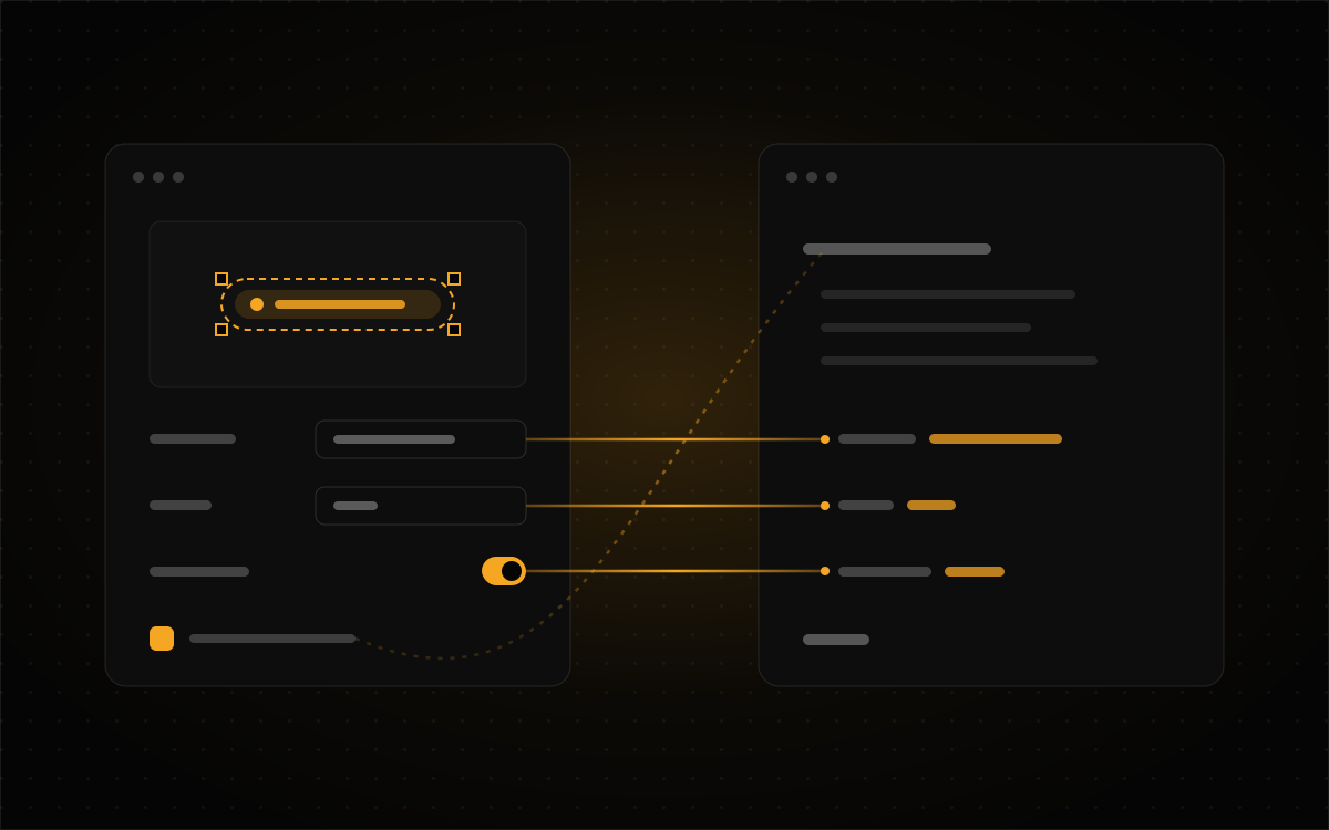
Every product team I've joined has had two design systems. One lives in Figma, one lives in the codebase, and on day one somebody cheerfully tells me they're "basically the same." They never are. The button radius is 6 in one and 8 in the other. The "warning" amber in the file is two shades off the one in production. And there's always a loan status in the app that the Figma library has never heard of, because an engineer added it mid-sprint and nobody told design.
Nobody did anything wrong, which is the annoying part. Drift is just what happens by default. Two copies of anything, edited by different people in different tools on different schedules, will wander apart unless something structural holds them together. Asking everyone to be more careful doesn't fix it (I've tried; it lasts about a sprint). What works is building the Figma file so that staying in sync is the easy path and drifting takes actual effort.
This post covers how I do that for the two kinds of product I've spent the most time in. One is fintech, meaning mortgage platforms like OmniRate and Platinum Loans. The other is property data, like PropertyReach and PropStream. Both are dense, both are full of numbers, and in both a small visual inconsistency can cost someone money. A mismatched status colour on a dashboard is a cosmetic bug. The same mismatch on a loan that's actually in underwriting tells a broker something false, and brokers tend not to find that charming.
Figure out which kind of drift you've got
"Design and code are out of sync" is really three different problems wearing one trench coat, and each one has its own fix.
| Kind of drift | What it looks like | Where it's fixed |
|---|---|---|
| Value drift the numbers disagree | A colour, spacing step, radius or type size differs between the file and the build. | Tokens: one set of named values that both sides read. |
| Structure drift the parts disagree | The Figma component has options the code doesn't, or the reverse. Designers mock up a state that can't be built. | Components whose properties match the code's props, name for name. |
| Behaviour drift the rules disagree | Each screen handles loading, empty, error or confirmation its own way, even though every component on it matches. | Patterns: documented compositions with rules, not just a look. |
Most teams spot value drift first because it's the easiest to see. Behaviour drift does the most damage, because it never shows up in a side-by-side comparison. Every individual piece matches, and the product still feels like it was built by six different teams who never met.
Tokens: name the decision, not the colour
Figma variables are the foundation, and how you structure them decides most of what comes after. I use three tiers, each in its own collection.
| Tier | Example | Who picks from it |
|---|---|---|
| Primitives | amber/500, grey/900, space/4 | Nobody, directly. Hidden from publishing. |
| Semantic | status/warning/fg, surface/raised, money/negative | Designers, for almost everything. |
| Component | input/border/focus, badge/pending/bg | Only the component that owns it. |
Primitives are the raw palette. Semantic tokens point at primitives and give them a job. Component tokens point at semantic ones when a component needs its own knob. Themes and density live as modes on the semantic collection, so flipping a frame from light to dark, or from comfortable to compact, is one setting instead of a second copy of every screen.
Three habits keep this layer from going soft. First, hide primitives from publishing. If amber/500 shows up in a designer's fill picker, somebody will use it, and it'll look perfect right up until the warning colour changes and that one screen doesn't follow. A designer can't pick a raw value they can't see.
Second, scope every variable. Figma lets you limit where a variable can be applied, so a spacing token never gets offered as a corner radius and a text colour never gets offered as a fill. Scoping turns a whole category of mistakes into options that simply never appear.
Third, use the same names in code. status/warning/fg in Figma becomes --status-warning-fg in CSS and status.warning.fg in your Tailwind config. Swapping slashes for dashes is fine. Anything cleverer means someone has to translate between the two, and translation is exactly where drift sneaks in.
What fintech adds to the token set
Generic design systems give you success, warning, error and info, and call it a day. Financial products need more than that, and they need to keep apart some meanings that a generic set happily mushes together.
The big one is that direction isn't judgement. A rate going up is good news for a saver and bad news for a borrower. So I keep money/positive and money/negative, which describe the sign, separate from status/success and status/error, which describe whether something worked. If those are the same token, then the first time a product manager asks for "a green that isn't success," the system has nothing to say.
Next, every workflow state gets a token, not a guess. A mortgage file moves through application, processing, underwriting, conditional approval, clear to close and funded, plus withdrawn and denied. If each one has a semantic token, adding a state is a deliberate change to the system. If they don't, someone just grabs the nearest amber and hopes for the best.
And tabular figures belong in the type tokens. Columns of currency only line up if every digit is the same width. I build a text style such as figure/body with tabular numerals switched on in its OpenType settings, and map it to font-variant-numeric: tabular-nums in code. That way it's a style you apply, not a setting somebody has to remember at 5pm on a Friday.
Getting tokens out of Figma
Pick one direction and stick with it. My default is to make Figma variables the source of truth for values, exported as JSON in the W3C Design Tokens Community Group format, then turned into CSS variables and a Tailwind theme by Style Dictionary. Nobody edits the generated file by hand. It's the same idea behind the generated data files on this site, for the same reason: if a file can be edited in two places, it will be.
Figma's REST API for variables is only on Enterprise plans. On any other plan, a plugin can read the same variables and export the same JSON. How the export runs doesn't really matter. What matters is that it's a step that happens, not a copy somebody makes when they remember.
Components: match the props, name for name
Most structure drift comes from one habit: building a Figma component to look like the design instead of to behave like the code. The fix is to write down the component's interface first, then build the Figma version to match it exactly.
Take a status badge in a loan pipeline. In code it looks something like this:
<StatusBadge
  status="underwriting"   // application | processing | underwriting | ...
  size="sm"               // sm | md
  showIcon={true}
/>
So the Figma component gets a variant property called status with those exact values, a variant property called size, and a boolean called showIcon. Not State, not Type=Default 2, and definitely not a hidden icon layer someone toggles by hand. When the names match, Dev Mode shows an engineer the exact props they'd write. When they don't, every handoff turns into a meeting.
Figma's property types map to code pretty cleanly. Variant properties are for enumerated props like status, size and intent. Boolean properties are for flags like showIcon, disabled and loading. Please don't make those into variants, because a boolean used as a variant doubles the variant grid every time you add one, and nobody enjoys scrolling that grid. Instance swap properties are for slots, like the icon in a button or the leading element in a list row. Set preferred values so the picker offers the five sensible icons instead of all four hundred. Text properties cover strings like label and helperText.
If your plan has Code Connect, link each component to its implementation so Dev Mode shows the real import and usage. If it doesn't, put the code component's name and a link to its Storybook page in the component description. It's less automatic, but the connection still exists.
Build the states nobody draws
A component that only exists in its happy-path state leaves every designer to invent the rest, and they'll each invent something different. For every data-bearing component in a fintech or property product, I build and name these before I call it done:
- Loading: a skeleton with the real layout's shape, not a spinner in a box.
- Empty: no results, and what the user can do about it.
- Error: the request failed, what to do next, and whether anything was saved.
- Stale: the data is there but old. Rates, valuations and property records all carry a timestamp that matters, and "as of 3 days ago" is very different information from a blank.
- Restricted: the data exists, but this user's plan or role can't see it. Property-data products are full of these, and it's not the same state as empty.
Design with the data you'll actually get
More drift comes from placeholder content than from any tooling gap. A property card designed with "123 Main St" and a $450,000 price looks lovely. Then it meets real data and falls over, and the fix gets made in code, where the designer never sees it.
So a component library should have a page of stress frames: each data component filled with the worst plausible real content. For the two domains in this post, that means a few specific kinds of chaos.
Owner names that aren't names, for a start. The Hendricks Family Revocable Living Trust dated March 14, 2009. PropertyReach surfaces owners behind LLCs and trusts, and that string has to fit somewhere. Then money at both extremes: $0.00, $12,450,000.00, a negative equity figure, and a value with no amount at all ("price on request", or an off-market property with no last sale). Addresses that break the pattern, like unit numbers, rural routes, or a parcel with no street address at all, only an assessor's parcel number.
Counts that swing by orders of magnitude matter too. One filter returns 3 properties and another returns 1.4 million, and 1,412,806 results takes up a lot more room than 3 results. And finally, everything missing: no photo, no beds and baths, no tax record. A property record is stitched together from several sources, and some of them will always come back empty.
Build the stress frames from the real components, not copies, so a component change shows up on the stress page right away. If the page breaks, congratulations, you found a bug before engineering did.
Patterns: write down the rules, not just the look
A pattern is a set of components arranged together, plus rules about when and how to use it. Patterns are where behaviour drift gets fixed, and they're also the part of a design system teams skip most often, because they don't fit neatly into a component panel.
The patterns I document first are the ones where getting it wrong costs money or trust. Confirming a money movement is top of the list: what's shown before commit (amount, destination, fees, when it arrives), what the commit button says (the action and the amount, never just "Confirm"), what happens on a double-click, and what the success state actually proves.
Search, filter, map and list come next. Which one is the source of truth when they disagree? What happens to the map when a filter removes every pin in view? How many filters show before the rest collapse? With more than 130 filters, as PropertyReach has, you really can't decide that screen by screen.
Document collection and verification is another: upload, scanning, rejected with a reason, accepted, and expired. Mortgage workflows run on these, and every state needs to tell the borrower what to do next. And figures with provenance round it out. An estimated value, a projected payment or a comparable sale should always show where it came from and how old it is, one step away.
A pattern page in Figma should hold the rules as written text next to the example frames, the anti-pattern with a short note on why it fails, and a link to where the pattern lives in code. If a pattern exists only as a picture, everyone who copies it will take away a slightly different rule.
Keeping them in step once it's built
Good structure makes sync possible. It doesn't keep things in sync by itself. A handful of habits do most of that work.
"Done" means it exists in both places. A component isn't finished when the Figma version is published, or when the code version merges. It's finished when both exist with matching properties and are linked to each other. I put that right in the ticket template so nobody has to remember it.
Library publish notes are release notes. Figma asks for a description every time you publish a library, and it's tempting to type "updates" and move on. Write it for engineers instead: what changed, what got renamed, and which code release carries the same change.
Treat detaches as signals, not crimes. A detached instance means the component couldn't do what a designer needed. Library analytics, where your plan has them, show which components get detached most. That list is your roadmap, not a list of people to go scold.
Test the code side visually. Screenshot tests on each component's states, in Storybook or Playwright, catch the code half drifting away from the agreed design. Figma can't check the build, but the build can check itself against a baseline you agreed on together.
And run a short drift audit on a schedule. Once a month, pick five production screens and compare each one to its Figma frame. Log what's different and which of the three kinds of drift it is. Fifteen minutes a month catches problems while they're still small and cheap.
When the system meets a case it wasn't built for
This is the moment that decides whether a design system holds up or slowly falls apart. Sooner or later, a screen needs something no component does. How the team handles it matters more than how good the library was.
Here's the kind of case that shows up. A mortgage pipeline has status tokens and badges for every loan state. Then the product adds rate locks, and a lock can be active and expiring in 48 hours. That's not the warning state, because nothing's wrong yet. It's not the success state either, because there's a deadline ticking. No existing badge says it.
The two common reactions are both bad. One is to detach the badge, pick a colour that looks about right, and move on. That's value drift, created on purpose and invisible to everyone else. The other is to refuse to design the screen until the system gets updated. That turns the design system into a bottleneck, and the team quickly learns to route around it.
I work down a ladder instead, and stop at the first rung that holds:
- Check that it's actually new. Often it isn't. An "expiring" state might already exist on the document-verification pattern under another name, so search the library before building anything.
- Compose before you fork. Can existing parts say it? An active badge next to a small countdown, built from the existing
metatext style, might say "active, expiring" more clearly than a new colour would, and it needs nothing new. - Extend deliberately if it'll come back. If expiring states are clearly going to recur (rate locks, document expiries, offer deadlines), add the capability to the component properly: a new semantic token, a new property value, the same change in code, and a publish note. It's an hour of work, and you only do it once.
- If you can't tell yet, build a labelled exception. Sometimes you don't know whether it's a one-off, and the deadline is Thursday. Build the local version, put it inside a frame clearly named
⚠ Exception: rate lock expiry, and add a note with the reason, the owner and a review date. Log it in the same place as the drift audit. An exception is fine as long as it's visible and dated. A silent one is just drift with better excuses. - Promote it on the third occurrence. When the same exception has shown up three times, it's not an exception anymore. It's a missing piece of the system. Promote it through step three and replace the local copies.
The same ladder works for property products. Say a record has three owners, one of them a trust, and the owner component assumes one person. First, check whether the contacts list pattern already handles several entries. It probably does, so compose. Is "multiple owners" going to recur across tens of millions of records? Almost certainly, so extend the owner component with a proper owners collection state instead of a special case on one screen.
Some things never get a spot on the ladder, because they're always wrong: a raw hex value, a spacing value outside the scale, a status borrowing another status's colour because it was "close enough", and a detached instance with no label. None of those are exceptions. They're drift the team just hasn't noticed yet.
If you only remember a few things
Work out which kind of drift you have before you fix it, because values, structure and behaviour each need something different. Tier your tokens, hide primitives from publishing, scope every variable, and use the same names in code. In fintech, keep direction separate from judgement, give every workflow state its own token, and make tabular figures a text style.
Match component properties to code props exactly, and build the loading, empty, error, stale and restricted states before calling anything done. Stress-test with real data: trusts as owners, eight-figure prices, missing records and enormous counts. Write patterns down as rules, especially anywhere money moves or a number needs a source.
And when the system doesn't fit, don't panic and don't detach in secret. Check that it's really new, compose if you can, extend if it'll come back, or build a labelled exception, then promote it the third time it shows up. Your future self, and every engineer who inherits the file, will thank you.