PropStream
The desk-side half of PropStream — nationwide property records, automated lists, and multi-channel marketing in one web workspace.
- Role
- Product & UI/UX Design
- Platform
- Web application
- Industry
- Real Estate / PropTech
- Scope
- Search, records, lists, marketing
Interactive prototype — best viewed on desktopInteractive prototype — click to try it
PropStream gives real estate investors nationwide property data, comps, and lead lists. This is the web platform: a map-and-list search across a whole market's distress data, the full public record behind any address, monitored lists that update themselves, and a campaign library that turns those lists into mail. Where the field app is built for speed in front of one house, the web app is built for volume — and the design problem is density, not simplification. An investor working a market needs every field, so the work was giving thousands of records a shape a person can actually read.
Read a market before opening a record.
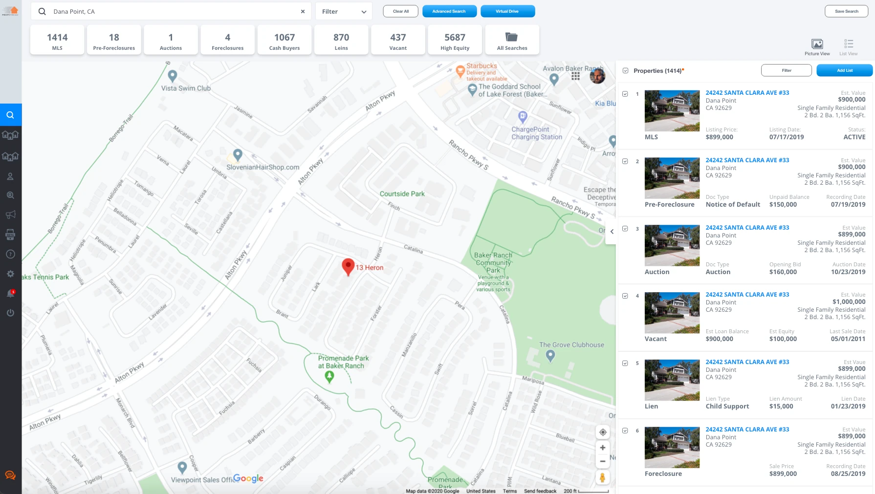
A search doesn't start with one address, it starts with a question about an area. The results page answers that first: a row of counts across every distress category sits above the map, so an investor sees how much pre-foreclosure, vacancy, or high equity a market holds before clicking into anything.
- Key jobs
- Scope, Filter, Scan
- Surface
- Map + list
- Differentiator
- Counts before commitment
Counts Above The Map
Eight categories — MLS, pre-foreclosures, auctions, foreclosures, cash buyers, liens, vacant, and high equity — are tallied for the current search and double as filters. The shape of a market reads in one glance, and narrowing it is one click from the same row.
Map And List Together
Geography and records stay on screen at the same time rather than behind a toggle. Each list row carries the fact that matched it — a notice of default and its unpaid balance, an auction's opening bid, a lien's type and amount — so the reason a property surfaced is never a click away.
Virtual Drive
Driving for dollars, done from the desk. Street view runs full-bleed with pins colored by distress type and a legend that stays put, and a property card overlays value and ownership facts without leaving the street.
Picture Or List
The results pane switches between thumbnails for judging condition and a dense list for judging numbers, because those are two different passes over the same search and neither should be the compromise.
The whole public record, in reading order.
Behind one address sits mortgage history, liens, bankruptcy filings, divorce records, comps, MLS data, and years of listing photos. Dumping that on a page makes it unusable. The detail view puts a decision-ready summary up top and files the raw record into tabs underneath, so depth is available without being in the way.
- Key jobs
- Assess, Verify, Annotate
- Structure
- Summary + 11 record tabs
- Differentiator
- Depth on demand
Summary First
Estimated value and its trend, mortgage and debt, comparables, and an opportunity read on equity and monthly rent sit above the fold as a card grid. That block alone answers whether a property is worth a second look.
Eleven Tabs For The Rest
Cash sale, liens, pre-foreclosures, divorce, bankruptcy, comps, MLS, linked properties, transaction history, and documents each get their own tab. A bankruptcy filing is thirty-odd fields of court and trustee data — real, occasionally decisive, and not something to make every user scroll past.
Photos As A Timeline
Listing photos group by the date they were taken rather than pooling into one gallery. Comparing 2008 against 2014 is how an investor reads whether a property has been maintained or left to slide.
Tags, Status, And A Log
Condition tags are checkboxes, deal status is a single dropdown, and every change writes a dated line to a status log naming who made it. On a shared lead, knowing that a teammate already sent an appointment matters as much as the property data.
A list that keeps itself current.
A marketing list goes stale the moment it's built — properties sell, foreclosures resolve, liens get paid. List Automator monitors saved lists against the national database and reports what moved, so the working surface is a grid built for sorting, filtering, and acting on thousands of rows at once.
- Key jobs
- Build, Monitor, Export
- Surface
- Data grid
- Differentiator
- Changes, not totals
The Grid Is The Product
Twenty-odd columns of address, valuation, debt, LTV, and equity, each with its own filter field in the header row. At this scale a table isn't a fallback for a nicer layout, it's the only interface that lets someone sort a pipeline by the number they care about today.
Deltas Beside Totals
Category counts run across the top, but new and removed properties get their own pair of tiles with direction arrows. What changed since yesterday is the reason to open a monitored list at all, so it isn't left for the user to work out by comparing totals.
Bring Your Own List
Import takes a downloadable template, offers to drop anything already saved, and keeps a history showing records against records processed. Failed imports stay visible in that history instead of disappearing into a toast.
Lists Belong To People
The rail separates favorites, marketing lists, and automated lists, then nests each teammate's lists under their name. On a team account the question is usually whose list it is, and the navigation answers it without a filter.
From the list to the mailbox.
Lists exist to be marketed to. The campaign library runs postcards, email, text, and ringless voicemail as one thing rather than four tools, and the account area handles the parts of a data subscription that quietly decide whether a power user has a good month: limits, credits, and team access.
- Key jobs
- Send, Track, Administer
- Channels
- Mail, email, text, RVM
- Differentiator
- One row shape
Four Channels, One Row
Every campaign renders in the same row — proof, order, audience, status, and reach — with a channel icon doing the differentiating. A postcard and a voicemail drop are the same job to the person running them, so they read the same way.
Status As A Timeline
A campaign's pill says where it is now; the dates beside it list saved, submitted, printed, and mailed. Direct mail takes days, and the difference between printed and mailed is exactly the question someone opens this page to answer.
Duplicate Over Rebuild
Duplicate and resend sit on every row. Investors run the same creative against new audiences constantly, and the fastest path to a second campaign is the first one.
Limits Made Visible
The billing header shows days left in the cycle and meters downloads and exports against the plan, with the controls to raise either right beside them. Hitting an export ceiling mid-pull is the worst moment to learn a limit exists.
Process
PropStream's problem was never a shortage of data, it was that the data was overwhelming. Almost every screen here is a density decision: what earns a place above the fold, what gets filed into a tab, when a table beats a card, and where a count is more useful than a list. I worked from the investor's actual sequence — scope a market, assess a property, build a list, market to it, watch the bill — and designed each surface to answer the one question that step is really asking, with everything else reachable rather than removed.
Research methods
- Investor workflow mapping, market to mailbox
- Data-density and table legibility studies
- Public-record taxonomy and information hierarchy
- Team and multi-user account patterns
Deliverables
- Web application UI across search, records, lists, and marketing
- Property detail system with tabbed public-record views
- List management, import, and automation interfaces
- Campaign library plus account, billing, and team administration
Next project
PropertyReach Mobile