PropertyReach
A nationwide property-data platform made approachable — search, 130+ filters, property intelligence, skip-traced contacts, lead lists, direct mail, and investor tools in one place.
- Role
- Product & UI/UX Design
- Platform
- Web
- Industry
- Real Estate / PropTech
- Data
- 160M+ properties
PropertyReach turns lead and property data for 160M+ properties into a tool real-estate investors, wholesalers, and agents use every day. I designed the full web platform — onboarding, a hub dashboard, map-and-list search, 130+ advanced filters, rich property intelligence, skip-traced owner contacts, saved and automated lead lists, a direct-mail postcard builder, investor calculators, and account, team, and API surfaces — all held together by one shared component system so depth never turns into clutter.
Find any property.
The product opens on a single search box, then splits into a synced map-and-list view. Users go from a question — an address, an owner, an area — to thousands of results they can pan, cluster, and scan without ever learning the database underneath.
- Key jobs
- Search, Browse
- Views
- Map · List · Thumbnails
Map + List, In Sync
A live map and a sortable results table sit side by side with clustered pins and a search-as-I-move toggle, so users can work spatially or row-by-row and never lose their place between the two.
Preset Quick Lists
Pre-foreclosures, high-equity, vacant, tax-delinquent, and other motivated-seller lists are one click from the dashboard, giving first-timers a productive starting point before they ever touch a filter.
Scannable Results
Result rows lead with the facts that drive a decision — value, beds, baths, size, year — and a hover preview surfaces equity, liens, and comps without leaving the list.
Narrow with precision.
Behind the simple search sit 130+ advanced filters — owner, property, MLS, foreclosure, liens, value, mortgage, and permit data, plus motivated-seller lead types like pre-foreclosure, vacant, high-equity, and tax-delinquent. I organized it as a categorized rail with an always-visible applied-filters summary and a running result count, so power users get depth without ever feeling lost.
- Key jobs
- Filter, Save
- Scale
- 130+ filters
Categorized Filter Rail
130+ criteria are grouped into a scannable left rail — owner info, characteristics, MLS, liens, value, mortgage — so users drill straight to what they need instead of scrolling a wall of inputs.
Live Applied-Filters Summary
A persistent panel shows every active filter as a removable chip alongside a real-time result count, so users always know exactly what they're looking at and can undo in one tap.
Quick Lists & Saved Filters
One-click quick lists surface motivated-seller lead types instantly, while custom quick filters and saved searches let repeat users rebuild a complex query and rerun it as new records match.
The full picture.
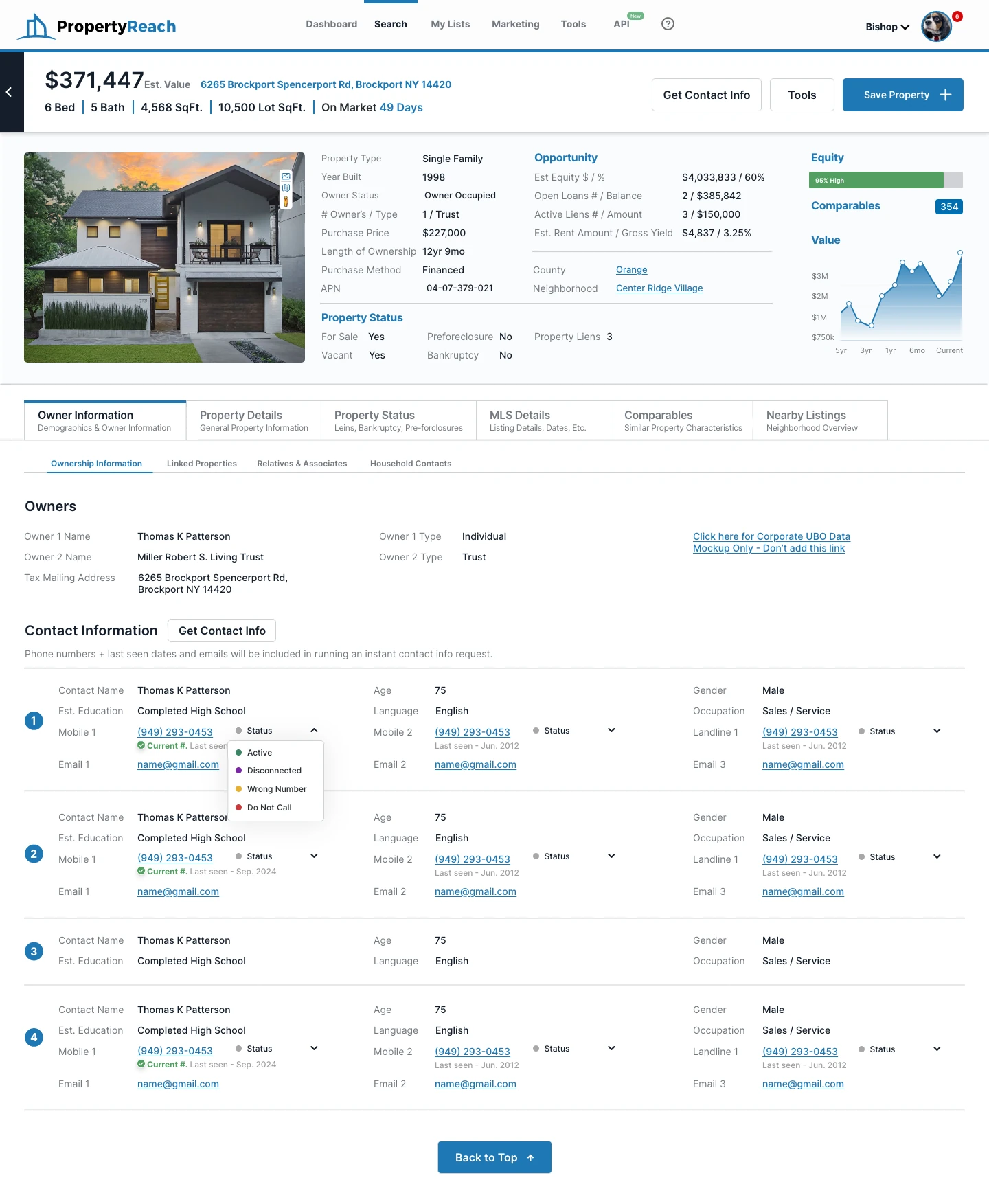
The property-detail page is the heart of the product. It pulls ownership, valuation, equity, tax, mortgage, liens, comparables, and neighborhood data into one tabbed profile — in both light and a refined dark theme — so an investor can qualify a lead without hunting across sources.
- Key jobs
- Analyze, Decide
- Differentiator
- Data in context
One Tabbed Profile
Details, status, MLS, comparables, and nearby insights live under a single header of headline stats — value, equity, rent, opportunity — turning a dense record into a readable, decision-ready profile.
Comps & Valuation
A comparables view pairs a mapped set of nearby sales with summary tiles and an editable comp search, so users can validate value and spot flip and rental potential in context.
Owner Contact & Skip Trace
Ownership and household sections lead into skip-trace flows for phone and email — including contacts behind LLCs and trusts — connecting research directly to outreach without a detour.
From lead to outreach.
PropertyReach isn't just search — it's a workflow. Saved and automated lists behave like a lightweight CRM, a drag-and-drop postcard builder turns a list into a direct-mail campaign, and investor calculators help users underwrite a deal before they act.
- Key jobs
- Organize, Market, Analyze
- Surfaces
- Lists · Postcards · Tools
Lists as a Lightweight CRM
Saved lists and auto-updating property lists carry lead status, assignment, and contact columns, so a search result becomes a pipeline the user can actually work.
Direct-Mail Postcard Builder
A layered, template-driven editor lets users design and send 6×4 and 6×9 postcards to a list — margins, imagery, and copy handled in-app — closing the loop from data to mailbox.
Investor Calculators
Mortgage, rental, DTI, wholesale, and fix-and-flip calculators live under one Tools hub so users can underwrite a deal without leaving the platform.
Built to scale.
Around the core product sits everything a growing team needs — onboarding, dashboards, billing and plans, credit wallets, team seats and permissions, and API access — all drawn from the same design system so the platform feels like one product from first login to developer integration.
- Key jobs
- Manage, Extend
- Surfaces
- Billing · Teams · API
Accounts, Billing & Wallets
Plan selection, wallet top-ups, and usage meters are designed as calm, legible flows, keeping the money layer — where every skip trace and postcard draws credits — trustworthy rather than intimidating.
Team Seats & Permissions
Team invites, roles, and per-member limits let an agency share one account without losing control, so the product scales from a solo investor to a full brokerage.
Developer & API Surface
An API dashboard with keys, usage, and self-checkout extends the same visual language to developers, so the data platform is coherent whether accessed by hand or by code.
Process
PropertyReach's challenge was approachability at scale — one product serving first-timers and power investors across dozens of interconnected surfaces, backed by data on 160M+ properties. I designed from the search box outward, making the common path effortless while keeping deep data one tap away, and unified every surface — search, detail, lists, marketing, tools, account, and API — on a single component system so the platform reads as one coherent product.
Research methods
- Search-first information architecture across many surfaces
- Filter and results usability at high data density
- Data-legibility studies for property intelligence
- Light and dark theme systems
Deliverables
- End-to-end web platform UI (search to account)
- Property intelligence, lists, marketing, and tools
- Skip-trace and owner-contact flows
- Reusable component system
Getting Started
3The Dashboard
2Search & Map
4Powerful Filters
5Property Intelligence
7Lists & Leads
4Direct-Mail Marketing
3Investor Tools
3Account, Team & API
5Next project
PropStream