PMP Marketing Group
Three years of design presentations for personal injury law firms — one role, dozens of clients, and the template system underneath them all.
- Role
- Senior Designer
- Scope
- ~40 client engagements
- Platform
- ColdFusion
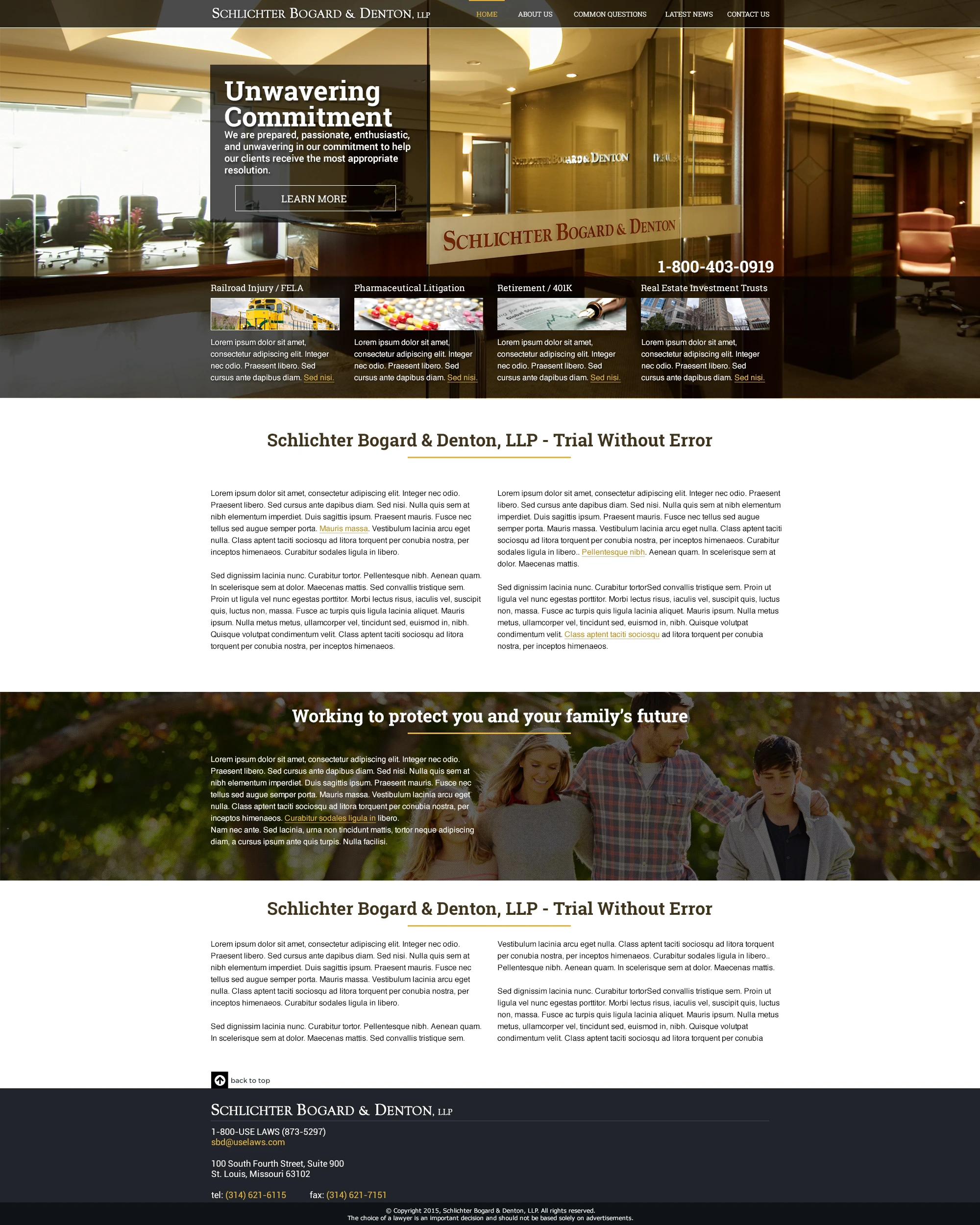
PMP Marketing Group sold websites to personal injury law firms, and the design presentation was the moment the sale was made or lost. My job was to produce those presentations: full-page homepage comps rendered at full fidelity, several competing directions per firm, and — once a route was approved — the interior pages that turned a single picture into a buildable system. Development then built to my design and template structure on a ColdFusion platform. The work below spans roughly forty engagements between 2012 and 2015, kept together as one showcase because it was one role, not forty projects.
Selling a site before a line was built.
Every engagement opened with full-page comps, not wireframes. A firm's partners are not a design-literate audience, so the proof had to look like the finished website — real photography, real navigation, real forms — and be judged the way a visitor would judge it.
- Deliverable
- Full-page homepage comps
- Per firm
- 2–8 competing routes
- Audience
- Firm partners
Comps at Full Fidelity
Each proof was rendered as a complete 2000px-wide page rather than a cropped hero, so partners scrolled the design the way a prospective client would. Body copy stayed as greeked text — the review was about structure and tone, and finished copy would only have pulled the conversation sideways.
Several Routes, One Layout
The Schlichter Bogard & Denton set holds the layout constant and swaps only the hero: a lone advocate, a mountain summit, a family on a lawn, the scales, a sunrise, the firm's own offices. Isolating the emotional register let the partners choose the feeling without relitigating the whole page.
The Brief on the Page
Each presentation shipped with the firm's stated design notes beside the comps — 'modern, professional, clean, drive towards the forms, responsive.' Putting the brief next to the work kept feedback anchored to what was agreed rather than to personal taste.
Approved, Then Extended
Only after a homepage route was signed off did the interior pages get designed. Several firms in this selection are represented by the approved comp specifically — the one that survived the room and went into build.
Designed to make the phone ring.
Personal injury marketing is direct response. These sites existed to convert an injured visitor into a case enquiry, and every layout decision was made against that job — which is why the same handful of elements recurs across firms that otherwise look nothing alike.
- Primary action
- Free case evaluation
- Channels
- Organic, PPC, mass tort
- Proof devices
- Verdicts, badges, video
The Form Never Scrolls Away
A 'Free Case Evaluation' panel sits in the upper right of nearly every comp, with the toll-free number set large in the masthead above it. Two ways to convert are visible before a visitor reads a word, because in this category the decision is often made in the first few seconds.
Credibility Before the Ask
Verdict and settlement figures, Super Lawyers and AV badges, 'As seen on' network logos, and attorney portraits sit high on the page. A visitor choosing a lawyer is assessing risk, so the proof had to land before the form did.
Campaign Pages Built to Match Ads
PPC and mass-tort pages strip the navigation down and mirror the ad that sent the visitor — Zithromax FDA warnings, the West Fertilizer Plant explosion, non-traded REIT fraud. Message match keeps the promise made in the ad intact on arrival.
Lowering the Barrier to Enquire
PKSD's 'Case or No Case' page reframes the ask entirely: instead of a contact form, a visitor submits a scenario and gets an answer. Asking a smaller question up front converts people who aren't yet ready to hire anyone.
One template, thirty-seven sites.
Volume at this pace only worked because the homepage was never the whole design. Behind the comps sat a scalable, responsive template system, and each engagement extended it with the interior page types that firm actually needed.
- Foundation
- Bootstrap template system
- Build platform
- ColdFusion
- Deployed
- 37 websites
Interior Pages as Deliverables
Content pages, attorney profiles, practice-area templates, mass-tort indexes and detail pages were all designed explicitly. Defining every page type up front is what stopped build teams from improvising layouts the design never covered.
Design Structure Drove the Build
Development across every site in this showcase was built to my design and template structure, on a ColdFusion platform. The comps and the page-type definitions were the specification the build worked from, which is why the same structural decisions hold across forty engagements rather than being re-litigated per client.
A Reusable Foundation
A shared Bootstrap-based template system carried responsive behaviour and performance work across engagements, so each new firm inherited a solved foundation and the design effort went into brand and conversion instead of re-solving layout.
Content-Heavy by Design
The LawMatters set — content, forum, mass-torts index, tort detail, practice area — shows the system carrying a publishing product rather than a brochure. Sidebars, related-topic blocks, and consultation forms repeat at every level so a visitor can convert from any depth in the site.
The System Travelled
KO-MAR Video Production and Intake Made Perfect sit outside personal injury entirely and still run on the same structural thinking. The framework held up once the subject matter changed, which is the honest test of whether it was a system or just a look.
Process
The work ran on a presentation cadence rather than a discovery cadence. Each engagement started with the firm's own brief — the design notes their partners wrote — plus a look at what their competitors in that market were running. From there I built competing full-page routes, presented them, took the feedback in the room, and extended the approved direction into interior pages and campaign variants. Working at that volume forced the discipline that mattered most: separating what genuinely had to be bespoke for each firm from what could be inherited from the template system underneath.
Research methods
- Client design briefs captured per engagement
- Competitive review of regional PI firm websites
- Direct-response conventions in legal advertising
- Mass-tort campaign and message-match requirements
Deliverables
- Full-page homepage comps, multiple routes per firm
- Interior page systems — profiles, practice areas, torts
- PPC and mass-tort campaign landing pages
- Responsive Bootstrap-based template foundation
Firm Websites
28Design Directions — One Firm, Six Routes
6Campaign & Landing Pages
12Page Systems
12Beyond Personal Injury
5Next project
Avid Air