Avid Air
The complete identity for a luxury private charter company — logo, brand system, website, and print collateral.
- Role
- Brand, Web & Creative Direction
- Industry
- Private Aviation
- Scope
- Identity, Print, Web
Avid Air sold private charter and aircraft management to a clientele that judges a company long before it ever boards. The brand had to read as established and discreet from its first impression, so I built one identity that would hold up equally on a business card, a hangar wall, and a homepage.
A monogram built to earn trust.
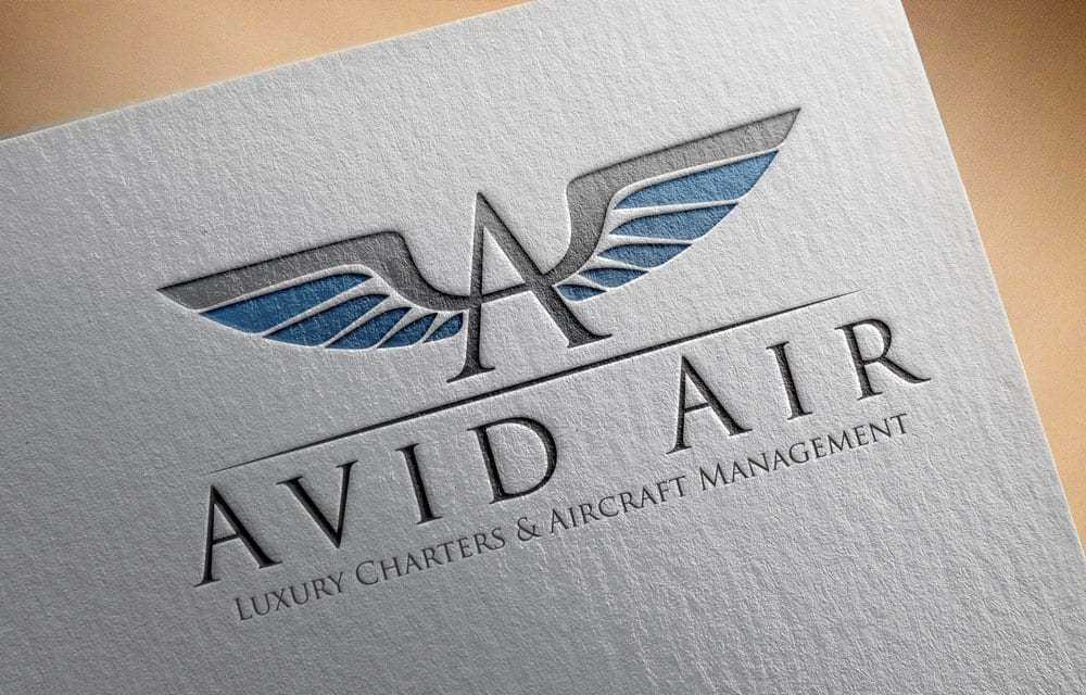
The mark pairs a pair of outstretched wings with an 'A' drawn as the tail of an aircraft — aviation heritage without the cliché of a clip-art jet. A classical serif wordmark and a hairline rule under it carry the descriptor, 'Luxury Charters & Aircraft Management.'
- Core mark
- Winged 'A' monogram
- Palette
- Graphite, black, aviation blue
- Variants
- Light, dark, single-color
Wings as the Letterform
Rather than setting a symbol beside the name, the wings and the 'A' are one drawing — the crossbar of the letter becomes the spine of the wing. It gives the company a mark that reads at signage scale and still resolves at business-card size.
A Restrained Palette
Graphite and black do the work; a single aviation blue is the only color in the system. Luxury reads as restraint here, and a near-monochrome palette also meant the mark survived every reproduction method the business would need.
Light and Dark Lockups
Every lockup was drawn twice — positive on white and reversed on black — so the identity was equally correct on a letterhead and on the dark hero of the website. No one downstream had to improvise a version.
Classical Typography
A high-contrast serif with generous letterspacing sets the wordmark, and small caps carry the descriptor. The typographic choice signals heritage and permanence, which is what a charter client is buying when they hand over a flight.
The brand in the physical world.
Charter is a handshake business, so the printed pieces mattered as much as the screen ones. I specified the identity across a stationery system and a set of premium print treatments, and mocked each one up so the client could see exactly what they were approving.
- Pieces
- Letterhead, envelope, cards
- Treatments
- Letterpress, emboss, spot UV
- Environmental
- Dimensional wall signage
A Complete Stationery System
Letterhead, envelope, notepad, and business cards were designed as one set, with the mark placed consistently and the contact details typeset to the same rules — so every piece a client received looked like it came from the same company.
Tactile Print Treatments
Letterpress on textured stock, a blind emboss, and spot UV on dark card all render the mark with no ink color at all. Specifying treatments that work by texture and light rather than color is what made the identity feel expensive in the hand.
Environmental Signage
The mark was extended to dimensional signage for a stone wall, testing that the wings held up as a physical object with real shadow — the version a client sees on arrival at an office or hangar.
Mocked Up for Approval
Each application was presented as a photorealistic mockup rather than a flat file, so the client could judge the identity in the situations it would actually appear in and sign off with confidence.
A website that sells the flight.
The site opens on a full-bleed hero of a jet on the tarmac with the mark centered over it, then works down through services, fleet, and proof. It was built to move a visitor from browsing to a charter enquiry without ever feeling like a booking form.
- Key sections
- Services, Fleet, Reservations
- Primary CTA
- Charter Services
- Extras
- Pre-launch holding page
Photography-Led Hero
The homepage leads with a full-width aircraft slider carrying the mark and a single 'Charter Services' call to action. In this category the aircraft is the product, so the photography sells and the interface stays out of the way.
Four Clear Services
Charter a Flight, Charter a Yacht, Aircraft Management, and Additional Services sit as four equal icon columns near the top. A visitor learns the full scope of the business in one glance rather than digging through a menu.
Proof Before the Ask
Featured jets, company partners, and client testimonials run above the reservations block, so the credibility a charter buyer needs is already on the page by the time they're asked to get in touch.
Reservations Made Legible
A dedicated Charter Reservations band breaks the process into Choose Service, Order Process, Payments, and Management — answering 'how does this actually work?' before the contact form and map close the page.
A Holding Page First
Ahead of launch, a countdown holding page carried the finished mark over the same hero photography. The brand was live and consistent from the day the domain went up, not the day the site shipped.
Process
I started with the mark, because everything downstream depended on it holding up at every size and in every material. Once the winged monogram and its variants were settled, I worked outward — stationery and print treatments first to prove the identity in the hand, then the website as the place most clients would actually meet the brand. Working as the sole designer across all of it meant the logo, the letterhead, and the homepage were designed against the same set of rules rather than reconciled afterward.
Research methods
- Positioning study of luxury charter and aircraft management brands
- Aviation heritage marks — wings, monograms, and livery conventions
- Print treatment and stock tests for a near-monochrome identity
- The charter enquiry journey, from first impression to contact
Deliverables
- Logo suite with light, dark, and single-color variants
- Stationery system — letterhead, envelope, cards, notepad
- Print treatment specs: letterpress, emboss, spot UV, signage
- Full marketing website design and pre-launch holding page
Next project
Platinum Loans