Personal Branding
One amber period, two typefaces, a plain voice — the brand system behind my own name.
- Engagement
- Personal brand
- Date
- July 2026
- Role
- Brand & Visual Design
- Deliverable
- Brand guidelines page
- Covers
- Wordmark, mark, color, type, voice, skills
- Source of truth
- The live site's tokens
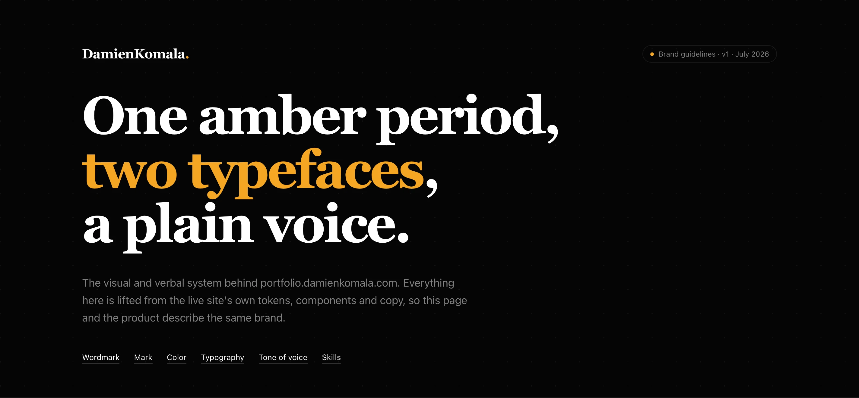
Most brand guidelines are written once and drift from the product within a month, because the product changes and the PDF doesn't. I built these the other way round. The portfolio site already had a token system, a heading rule, a logo component and a body of copy, so the guidelines document what was already true rather than describe something aspirational. Each hex value comes from the site's stylesheet and each type size from a live component. The voice examples are sentences already published. If the two ever disagree, the site wins and the page gets corrected.
A name, a period, and nothing else in color.
The wordmark is DamienKomala, one word, in Playfair Display Bold, closed by an amber period. The period carries the whole brand in one character: it says the sentence is finished. Everything else in the system follows from keeping that one mark of color rare.
- Key jobs
- Recognise, Remember
- Where
- Navbar, footer, favicon
- Differentiator
- One colored character
One Word, Camel-Cased
Always DamienKomala in the mark, never spaced, capitalised or set in two weights. In running text it goes back to "Damien Komala" with a space. The guidelines show the mixed-weight version as a don't, because it's the first variation anyone reaches for.
On Amber, The Mark Goes One Color
An amber period on an amber fill disappears, so on amber the whole wordmark turns near-black. The rule is that the period alone carries amber, and on a fill that is already amber, nothing does.
DK. For Small Spaces
The monogram keeps the same face, the same period and the same color rule, and takes over wherever the full name won't fit: the favicon, avatars, and the placeholder on blog cards with no header image. It's shown at 96, 48, 32 and 16 pixels so the smallest size is a decision, not a surprise.
Near-black, white, and one amber.
Dark is the default and the brand; light is opt-in from the navbar. Amber is the only hue in the system, and the guidelines are specific about what it's allowed to do: fills, small accents and the period. It never carries a sentence by itself.
- Key jobs
- Apply, Check, Copy
- Session
- Reference, on demand
- Differentiator
- Ratios on every swatch
Contrast Is Printed On The Swatch
Muted grey clears 5.16:1 on dark, the light-theme focus ring 3.95:1, the danger red 5.87:1. The light-theme amber ink measures 1.87:1, and the swatch says so along with the rule that makes it safe: decoration only, never the only copy that states something.
Amber Is Attention, Not Error
Failures get their own red, so a broken state never looks like a busy one. It's a small rule that stops the one brand color from picking up a second meaning.
The Tag Decides The Face
Every heading is Playfair Display and everything read rather than looked at is Inter: body, labels, buttons, stats and prices. Assigning it by tag means mirrored blog posts and new pages get it right without anyone remembering a class. The chat assistant opts out, because serif headings inside a chat reply read as a bug.
Say the number. Show the hours.
The verbal half of the brand is the harder one to keep consistent, so it gets the same treatment as the visual half: rules, examples, and the wrong version shown next to the right one.
- Key jobs
- Write, Edit, Check
- Where
- Site, proposals, email
- Differentiator
- Two registers
Four Pillars, Each With A Real Quote
Specific, plain, candid, two-sided. Every pillar is backed by a sentence already on the site — "Most clients do not need a retainer" carries candor better than a description of it could.
Write This, Not That
"Passionate, innovative designer delivering world-class solutions" sits struck through beside the job title and the industries it actually means. Showing the cliché next to its replacement is faster to apply than any rule about adjectives.
Two Registers, Not One Tone
The site and formal mail are confident and spare; collaborators and friends get warmth first and the odd "hit me up". Naming both stops the friendly voice leaking into a recruiter email, and the formal one into a note to a tester.
Process
I started from the site rather than from a mood board. The tokens in the stylesheet, the logo component and the heading rule were already in production, so the first pass was an inventory: every color, size and rule that actually ships. Only then did I write the guidelines around it, adding the reasons each rule exists and the contrast figures that justify them. The voice section came from the published copy, sorted into what worked and what I'd stopped doing. The page is built in the same faces and tokens it documents, so it doubles as a working example of the system.
Research methods
- Inventory of the live site's color tokens, type scale, logo component and heading rules
- Contrast measurement of every text-bearing pairing in both themes
- Review of published site copy to pull the voice pillars and before-and-after pairs
- Audit of the résumé and homepage skills lists to fix one canonical order
Deliverables
- DamienKomala. wordmark with primary, light, on-amber and single-color versions
- DK. monogram for favicon, avatar and placeholder use
- Dark and light color palettes with contrast ratios and usage rules
- Two-face type system and full type scale
- Tone-of-voice guide with pillars, examples and two registers
- Canonical skills and industries list for every bio and profile
- Responsive brand guidelines page
The guidelines
9Responsive — 390px
4Next project
Momentix