Events by Ness
A booking site for a luxury balloon-styling studio — where the design job is to answer the questions that decide whether an enquiry gets sent at all.
- Engagement
- Client project
- Role
- Web Design & Front-End
- Platform
- Responsive web, 390px → desktop
- Sector
- Event styling, Southern California
- Scope
- 6 pages, two themes
- Build
- Next.js App Router
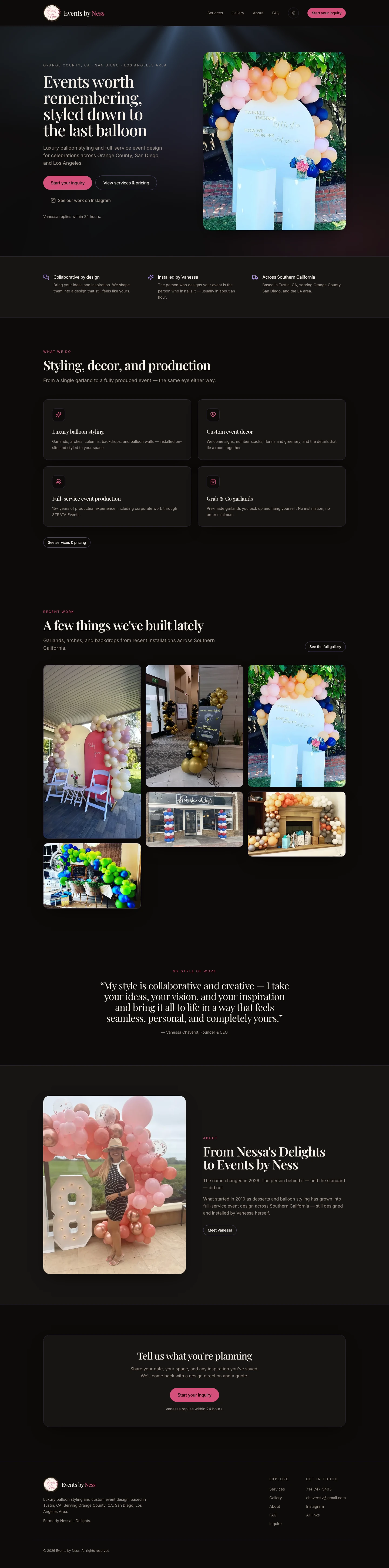
A styling studio does not sell through a website; it sells through a conversation that a website has to earn. Vanessa books events one enquiry at a time, and every enquiry costs her a reply within 24 hours — so the site's job is not to maximise submissions, it is to make the submissions worth answering. That reframes the whole page hierarchy. Anything a visitor needs to know before they'd commit to a date belongs above the form, not behind it: what the work looks like, what the standard pieces cost, and the four policies that decide whether a booking is even possible. The form itself then only has to collect the things Vanessa can't guess.
Pricing that answers the question first.
Most studios in this category quote on request. That protects margin on custom work, but it also means the visitor who only wants a 10-foot garland has to start a conversation to find out whether they can afford one — and most of them don't. The services page publishes the rate for every standard piece, and reserves "quoted individually" for the custom designs where it's actually true.
- Key jobs
- Estimate, Compare, Qualify
- Session
- Minutes, pre-contact
- Differentiator
- Published rates
Five Rate Cards, Not One Price List
Structures and backdrops, arches and columns, garlands, Grab & Go, and add-ons each get their own table. Grouping by what the piece is — rather than by price — means a visitor scans one table instead of reading forty rows, and the Grab & Go tier stays visibly separate as the entry point it is.
Every Rate Carries Its Unit
A garland is priced per foot, a number stack per number and base, columns per pair. The unit sits under the item name rather than inside the price, so the cost column stays a single scannable column of figures and no rate can be misread as a flat fee.
The Constraints Sit With The Prices
The $250 installation minimum, the two-week booking window and its $25 rush fee, and the 15-mile travel radius are stated at the top of the pricing page — not in terms buried at the bottom. A price a visitor later discovers they can't actually book at is worse than no price.
Custom Work Is Named As The Norm
The page says most events end up as a mix. That keeps the published rates from reading as a fixed menu the studio is confined to, while still giving the visitor a real anchor for what their event will cost.
A long form that reads as a short one.
Vanessa's first reply is only useful if the enquiry contains a date, an address, a space, and some sense of the design. That is a lot of fields for a phone. The form asks for all of it, but presents itself as five short passes rather than one long wall — and is explicit about which fields it can live without.
- Key jobs
- Describe, Locate, Send
- Session
- One sitting, often mobile
- Differentiator
- Seven required fields
Five Sections, Each One Answerable
Your details, the event, where it's happening, on-site contact, your vision. Each block asks about one thing the enquirer already knows, so the form never demands a context switch mid-scroll. The on-site contact block opens with the condition that makes it skippable — only if someone else will be there.
Optional Is Labelled, Required Is Summarised
Every non-essential field carries "(optional)" in its own label, and the seven that are genuinely required are restated in one line beside the send button. The enquirer can see the true cost of submitting before starting, rather than discovering it at validation.
Placeholders Do The Teaching
The vision field's helper text lists the vocabulary — garland, tower, numbers, balloon wall, clusters, circle backdrop, arch — because a client who doesn't know the words describes the design badly, and a badly described design costs an extra round trip.
The Photo Path Is Stated, Not Built
Photos are what make a first reply accurate, but an upload field on a styling site invites 40MB phone captures and a failure state at the worst moment. The form asks for them by text or email instead, at the point the enquirer is already committed. A deliberately unbuilt feature, not a missing one.
Thirty-two installations doing the arguing.
Nothing on the site persuades as well as the work. The gallery is the only page where the design's job is to disappear — but 32 photographs of balloon installations, shot on-site in wildly varying light, will look like a scrapbook unless the grid imposes something.
- Key jobs
- Browse, Recognise, Trust
- Session
- Scroll-led, low intent
- Differentiator
- Captioned by occasion
Captions Name The Occasion And The Space
"Baby shower, backyard install", "School banquet, step-and-repeat arch", "Storefront opening, matched columns". A visitor planning a graduation in a garden is looking for their own event in the grid, not for a style — so the caption indexes on occasion and setting rather than on colour or technique.
The Range Is The Argument
The set spans backyards, storefronts, venue lobbies, staircases, poolsides, and dining rooms. Ordering it to keep those settings interleaved — rather than clustered by type — means the breadth registers on a scroll instead of only on a count.
Recent Work Previews, It Doesn't Duplicate
The home page carries a short strip of recent installations and a single route to the full set. It's a sample sized to prompt the click, not a second gallery that makes the real one redundant.
A dark default and a real light mode.
The brand reads as an evening one — deep near-black, a rose accent, a high-contrast serif — and dark is the intended first impression. But a lot of this audience is planning a daytime event on a bright phone, and a light theme that's only a tint inversion looks cheap next to photography. Both palettes are authored, and each is checked against the same photographs.
- Key jobs
- Read, Browse, Fill in
- Session
- Either, per visitor
- Differentiator
- Both authored
The OS Preference Is Deliberately Not Consulted
Dark is the brand, so it's the default for everyone — a visitor whose laptop is set to light still sees the site as intended. The switcher in the header is the only thing that changes it, and the choice persists per browser, so a returning visitor gets what they chose rather than what their OS assumes.
The Accent Splits Between Fill And Text
The rose that reads well as a button fill is too light to sit as text on a warm off-white. Light mode keeps the fill and darkens the text-and-link variant to a deeper berry, so the accent stays recognisably the same colour while the type stays readable in both themes.
No Flash Of The Wrong Theme
A blocking script resolves the stored preference before first paint and sets it on the document root, so a light-mode visitor never sees a dark frame flash first. It updates the browser chrome colour in the same pass.
Photography Sets The Surface Values
Light mode is a warm off-white rather than pure white, and the section bands alternate by a small step. Balloon photography is mostly pale pinks and creams; against a pure white the images bleed into the page and lose their edges.
Rate tables that survive a 390px column.
Enquiries arrive from a phone, usually from Instagram. Everything on the site has to hold at 390 pixels — including five pricing tables and a five-section form, the two elements most likely to be quietly dropped from a mobile layout.
- Key jobs
- Price, Browse, Enquire
- Session
- Phone, often referred
- Differentiator
- Nothing hidden on small
The Tables Keep Both Columns
Item and cost stay side by side rather than stacking into repeated label-value pairs. The unit qualifier wraps under the item name, which is where the space exists, so the price column stays right-aligned and scannable at the narrowest width.
The Form Is Native Where It Should Be
Date, time, phone, and email use the input types that summon the right phone keyboard and picker. On the one page where mobile completion actually matters, the platform's own controls beat a custom widget.
One CTA, Repeated Rather Than Multiplied
"Start your inquiry" is the same control in the header, at the end of every page, and in the footer. On a phone the visitor is never more than a short scroll from the action, without the page having to sprout a floating bar.
Process
I started from the enquiry rather than the pages: what does Vanessa need in a message for her first reply to be useful, and what does a visitor need to know before they'd send one? Those two lists set the whole structure — the second became the site, the first became the form. Publishing the rates was the decision the rest depended on, so it was settled first, with the business constraints written next to them rather than in terms. Copy was drawn from Vanessa's own language about her work, kept in her voice, and the four booking policies were reduced to a single set of numbers stated identically wherever they appear. I built it as a Next.js front-end so the pricing tables and the form could be tested at real widths rather than asserted in a mockup.
Research methods
- Sessions with Vanessa on how enquiries actually arrive and what makes one answerable
- Review of the enquiry backlog for the questions asked before booking
- Competitive scan of Southern California balloon and event stylists, and their quote-on-request norm
- Audit of the existing Nessa's Delights presence for what had to carry across the rebrand
- Photography review across 32 past installations to set the gallery grid and both surface palettes
Deliverables
- Six-page responsive site: home, services, gallery, about, FAQ, inquiry
- Published pricing structure across five rate cards, with policies stated inline
- Structured enquiry form with a seven-field required set
- Dark and light themes, dark as default, persisted per browser
- Site copy in the founder's voice, including FAQ and booking policies
- Built and deployed front-end at eventsbyness.com
The site — dark (default)
6The site — light
6Responsive — 390px, both themes
12Next project
Tyler 4 Data