Tyler 4 Data
A consultancy site for a real estate data strategist — where the design constraint is what the site is not allowed to say.
- Engagement
- Client project
- Role
- Product Design, Front-End & AI
- Platform
- Responsive web, 390px → desktop
- Sector
- Real estate data & PropTech
- Scope
- 8 routes, two themes, one assistant
- Build
- Next.js 15 + Python assistant
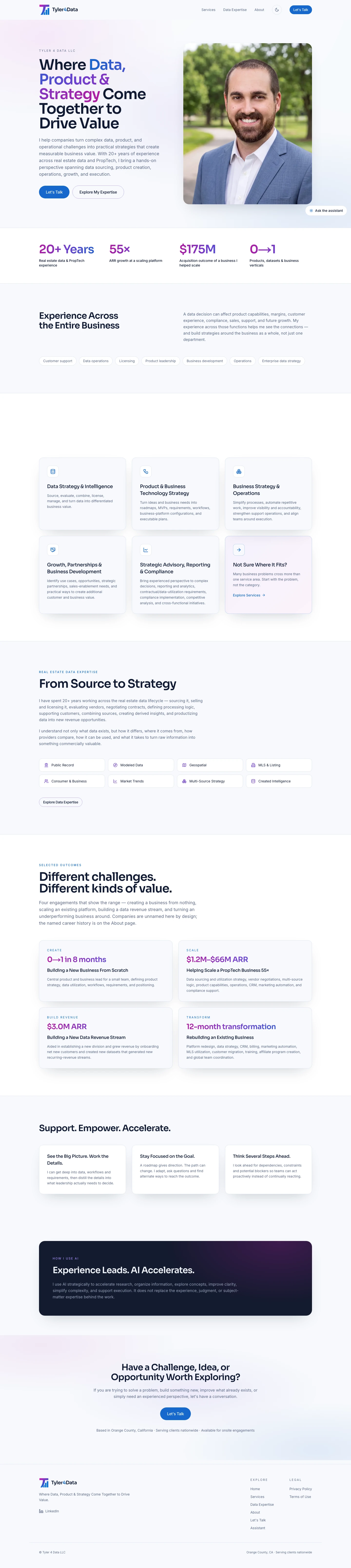
Most consultancy sites are built out of the things this one was not allowed to have. No rate card — the brief puts pricing out of scope and forbids hourly rates, prepaid minimums and block sizes by name. No logo wall — every company Tyler has worked with is a former employer, and a grid of their marks is the visual grammar of a client list. No unqualified outcome — the 55× growth and the $175M acquisition belong to businesses he helped scale, and six separate sections of the brief say so. And no email address, phone number or street address anywhere, which makes one form the site's only channel. Working inside that left exactly one currency: specificity about the work itself. So the site spends its space on what twenty years across the real estate data lifecycle actually consists of — which sources, which conflicts, which decisions — and lets that stand where the proof normally goes.
Credibility without a client list.
A visitor arriving from LinkedIn has one question: has this person solved my problem before. The obvious answers — logos, named clients, published outcomes — are all unavailable. The homepage answers it with four figures and four unnamed engagements, each written so the achievement is legible and the attribution stays honest.
- Key jobs
- Assess, Compare, Qualify
- Session
- Minutes, first visit
- Differentiator
- No named clients
The Qualifier Lives Inside The Sentence
The $175M figure is labelled “Acquisition outcome of a business I helped scale” and the 55× figure names no actor at all. An earlier version carried a separate footnote under each stat; the client's change doc removed them. Rebuilding the requirement into the label itself means the claim cannot be separated from its qualification by a later edit that only looks like tightening.
Four Outcomes, Every Company Anonymised
The homepage case studies read “Building a New Business From Scratch” and “Helping Scale a PropTech Business 55×”. The companies behind them are named on the About page, in a career timeline where they are unambiguously employers. Same facts, two contexts, and only one of those contexts could be misread as a client roster.
Flexible Engagements Instead Of A Rate Card
A pricing table with no numbers in it reads as evasive. The services page replaces the section entirely with a statement of how engagements are shaped — by problem, not by package — so the absence is a position rather than a gap. The table component exists behind a flag for the day the client publishes rates.
One Channel, Deliberately
No email, phone number or address appears on any route, including in a mailto: on the form's offline fallback — an href publishes an address as surely as printed text. The intake form is the only way to reach him, which also means the form is where the qualification happens.
Depth that survives being skimmed.
The expertise page is the one that has to convince a data leader, and it is also the one most likely to become an unreadable wall. Six specialties, six dataset categories, and a set of derived products all need to be visible to a search crawler and none of them can cost a skimming visitor their patience.
- Key jobs
- Evaluate, Verify, Shortlist
- Session
- Long, technically literate
- Differentiator
- Named specialties
Accordions For Detail, Cards For Scope
The six dataset categories collapse — the detail stays in the DOM and stays crawlable, but the page reads as a list of six things rather than six paragraphs. The specialties above them stay open as cards, because that set is the argument and it has to land without a click.
The Lifecycle Is The Spine
Source, evaluate, license, combine, resolve, derive, productise. The page is ordered as the sequence a dataset actually moves through, so a reader who only reads headings still comes away with the shape of the practice rather than a bag of capabilities.
Created Intelligence Named, Never Explained
Vacant properties, tired landlords, motivation to sell, roofing opportunities — the derived products are listed as tags, and the page says plainly that formulas, weights and source combinations stay confidential. Naming them proves the capability; withholding the method is the capability.
A light default the brief argued for.
The first build made dark the default, on the reasoning that the logo's magenta → violet → blue gradient holds its identity on deep navy and goes muddy on white. The brief asked for the opposite: light and neutral grounds dominate, dark tech backgrounds listed under Avoid. That is a client instruction about how the brand presents itself, not a technical claim, so it won — and the dark theme stayed a first-class palette rather than a leftover.
- Key jobs
- Read, Scan, Trust
- Session
- Either, per visitor
- Differentiator
- Both authored
The Palette Lives Once, As Channel Triplets
Every colour is declared in one stylesheet as bare RGB channels so Tailwind can compose them with an alpha slot, and the config only names them. That is what makes a theme a data change instead of a dark: prefix on several hundred class names — and what keeps a token like border-accent/40 working in both.
Every Pair Carries Its Contrast Ratio
Each foreground/background token has its measured ratio in a comment beside it, and all of them clear WCAG AA. A colour quietly dropping below 4.5:1 is the likeliest accessibility regression on a themed site and nothing else catches it, so the number is stored where the change happens.
The OS Preference Is Not Consulted
The two grounds are different presentations of the brand rather than a comfort setting, so which one a visitor meets first is a brand decision. The switcher in the navbar is the only thing that changes it, and the choice persists per browser.
The Hero Shader Reads The Palette At Runtime
The aurora behind the hero is a WebGL gradient sampling its colours from the same CSS variables the rest of the page uses, converted at one point rather than copied as hexes. It follows a theme switch for free and cannot drift from the stylesheet.
A chat that cannot invent a number.
A consultancy site gets the same six questions, and answering them is exactly the work a chat assistant is good at — right up until it improvises a rate, promises a turnaround, or credits a company's acquisition to one person. Those are the failures the whole site was designed to avoid, so the assistant enforces them in code rather than in a prompt.
- Key jobs
- Ask, Clarify, Convert
- Session
- Any page, on request
- Differentiator
- Guardrails, not prompting
Six Checks Scan Every Response
Price, fabricated metric, sole attribution, contact detail, overclaimed role, commitment. A violation becomes a retry carrying the specific breach back to the model, and an exhausted retry budget serves a safe deflection instead of the text that failed. A prompt asks; a scanner decides.
It Validates Before It Streams
The service runs the answer to completion and checks the whole thing before the first byte leaves. A fabricated figure rendered in a browser for two seconds is the harm — the run raising a moment later does not un-take the screenshot. The cost is a longer wait for the first token, which is why the typing indicator is a real component.
A Separate Toolchain, Deliberately
Python 3.12, Pydantic AI and FastAPI, deployed as its own project and reachable only through the site's own origin. Nothing in it imports from the site and nothing in the site imports from it, so the assistant can be removed without touching the pages it answers about.
Its Rules Are Stricter Than The Site's
The client's change doc removed several disclaimers from the pages, and the assistant kept them. A page has a designer's control over what sits next to a claim; a generated sentence does not, so the two are allowed to diverge and the divergence is written down.
Every route, down to 390 pixels.
The traffic arrives from LinkedIn on a phone. All eight routes hold at 390px — including the six-category accordion set and a ten-field intake form, the two components most often quietly simplified out of a mobile layout.
- Key jobs
- Read, Assess, Enquire
- Session
- Phone, referred
- Differentiator
- Nothing hidden on small
The Form Keeps All Of Its Fields
Role and industry stay as native selects, the optional fields keep their labels, and the helper text under the website field survives. Cutting fields on mobile would mean the qualification that makes an enquiry answerable happens on desktop only.
The Accordions Earn Their Keep At This Width
What is a nicety on a 1440px page is the difference between a readable page and a scroll marathon at 390. The same component does both jobs, which is why the detail could stay in the markup instead of being cut for small screens.
The Assistant Is A Labelled Pill, Not A Bubble
An unlabelled corner bubble is the convention that promises a live person, and on a one-person consultancy that expectation is specifically wrong — the person it implies is the one you are trying to hire. It says “Ask the assistant”, and nothing auto-opens it.
Process
The site existed before the brief did, built from Tyler's public LinkedIn profile, and then two versions of a PRD and a change doc arrived on top of it. Where the build and the brief disagreed, the brief won, and every reversal was written down rather than quietly applied — that record is what let a later edit be checked against a decision instead of re-argued. I moved all copy out of components and into data modules so a claim lives in exactly one place, then wrote specs that assert the prohibitions directly: no dollar figure outside the approved five reaches a page, no employer name reaches the homepage, no email or phone number reaches any route. Design and front-end ran together in Next.js so the accordions, the rate-free services page and the intake form could be tested at real widths. The assistant came last, as a separate service, so an unapproved feature stayed removable in one command.
Research methods
- Two versions of the client's PRD plus a change doc, with every claim traced back to a section number
- The client's public LinkedIn profile, used to build the pre-brief site and superseded wherever the brief disagreed
- A capability guide written for the chatbot, which supplies the assistant's knowledge base and deliberately reaches further than the site
- Contrast measurement across every foreground/background pair in both themes, recorded beside each token
- Bundle-cost measurement on the assistant, which is lazy-loaded because a static import cost 246 kB on every route
Deliverables
- Eight-route responsive site: home, services, data expertise, about, contact, assistant, privacy, terms
- Light and dark themes, light as default, persisted per browser with no flash of the wrong one
- Five-category service architecture standing in for the pricing the brief rules out
- Intake form and validated send endpoint, the site's only contact channel
- Claude Sonnet 5 assistant as a separate Python service, with a six-check guardrail suite
- 104 Playwright specs across four browser profiles, including assertions on the content prohibitions
- Built and deployed at tyler4data.com
The site — light (default)
6The site — dark
6Responsive — 390px, both themes
12Next project
Guided Health Navigation