Storybook MCP for UI Teams: Sharing Components, Reading Results, and Keeping the Design Honest

A component library usually has two audiences that never quite meet. Designers look at it in Storybook. Developers look at it in the code. Now there's a third reader, the AI agent writing half the new UI, and until recently it couldn't see the library at all. It read your source files, guessed at the props, and invented a shadow prop because every other button library has one.
Storybook's MCP addon fixes that. It turns a running Storybook into something an agent can query: which components exist, what their documented props are, what each story looks like, and whether the stories pass their tests. I set it up on the operator dashboard for Rockwell Investor Software, my personal trading-system project, and ran it end to end this week. Some of it went exactly as advertised. Some of it didn't, and those parts taught me more.
What the setup actually is
The dashboard is Next.js. I added Storybook 10 with the nextjs-vite framework and five addons: docs, accessibility, the Vitest runner, Chromatic, and @storybook/addon-mcp. The MCP server lives inside the Storybook dev server, at localhost:6006/mcp, and the project's .mcp.json points the agent at it. That's the whole integration. No separate service, no API key.
Once it's running, the agent gets a small set of tools. The ones I used most:
docs-listanddocs-showreturn the component catalogue and each component's documented props and stories.get-storybook-story-instructionstells the agent how this project writes stories: imports, patterns, testing conventions.stories-previewreturns a live URL for any story, which is the thing you paste into a pull request.test-runruns the stories' interaction tests and the accessibility checks, and reports what passed and what didn't.
The important consequence is in the server's own instructions: if a prop isn't documented, the agent is told it doesn't exist. That one rule does more for consistency than any style guide I've written.
Lesson one: the MCP is only as good as your stories
The first time I called docs-list, it returned four things: Button, Header, Page and a "Configure your project" doc. Storybook's starter examples. None of the dashboard's real components had a story yet, so the agent had nothing to read. The tools worked perfectly and told me nothing.
That sounds obvious written down, but it's the trap most teams will fall into. They install the addon, see green lights, and assume the agent now "knows the design system." It knows exactly what's in your stories and nothing else.
So the real first step was writing the stories. The agent wrote 138 of them for 24 components in one pass, and the library has since grown to 167 stories across 30 files, including the full pages. A few decisions made them worth having:
- Mock at
fetch, not at the component. A small mock in.storybook/mockApi.tsserves the same fixture file the deployed demo falls back to, and the real data-loading code runs on top of it. The stories exercise the actual code path, not a stand-in. - An unmocked write answers 501. Never a fake success. If a story forgets to set up a response, it fails loudly instead of pretending an order went through. Nothing in a story can reach the local API or the broker.
- Every state gets a name. Live data and demo data, loading, offline, empty, refused by the server, and the light theme. If a state exists in the product, it exists as a story.
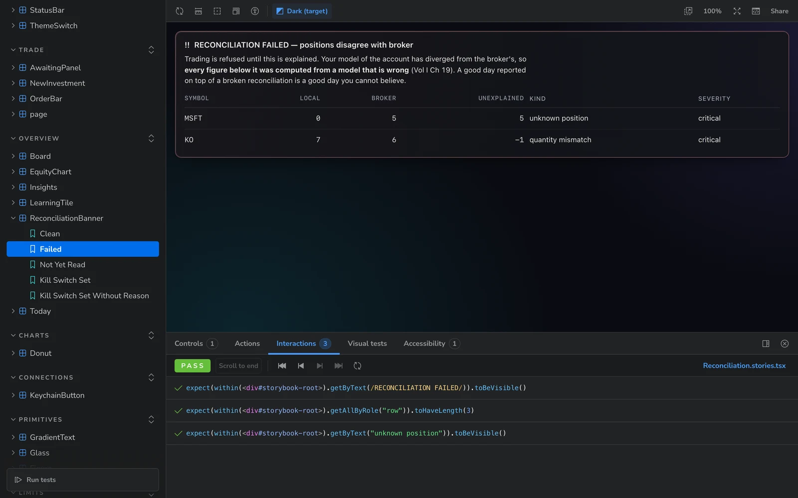
unknown_position is printed as plain words.Story names are a shared vocabulary
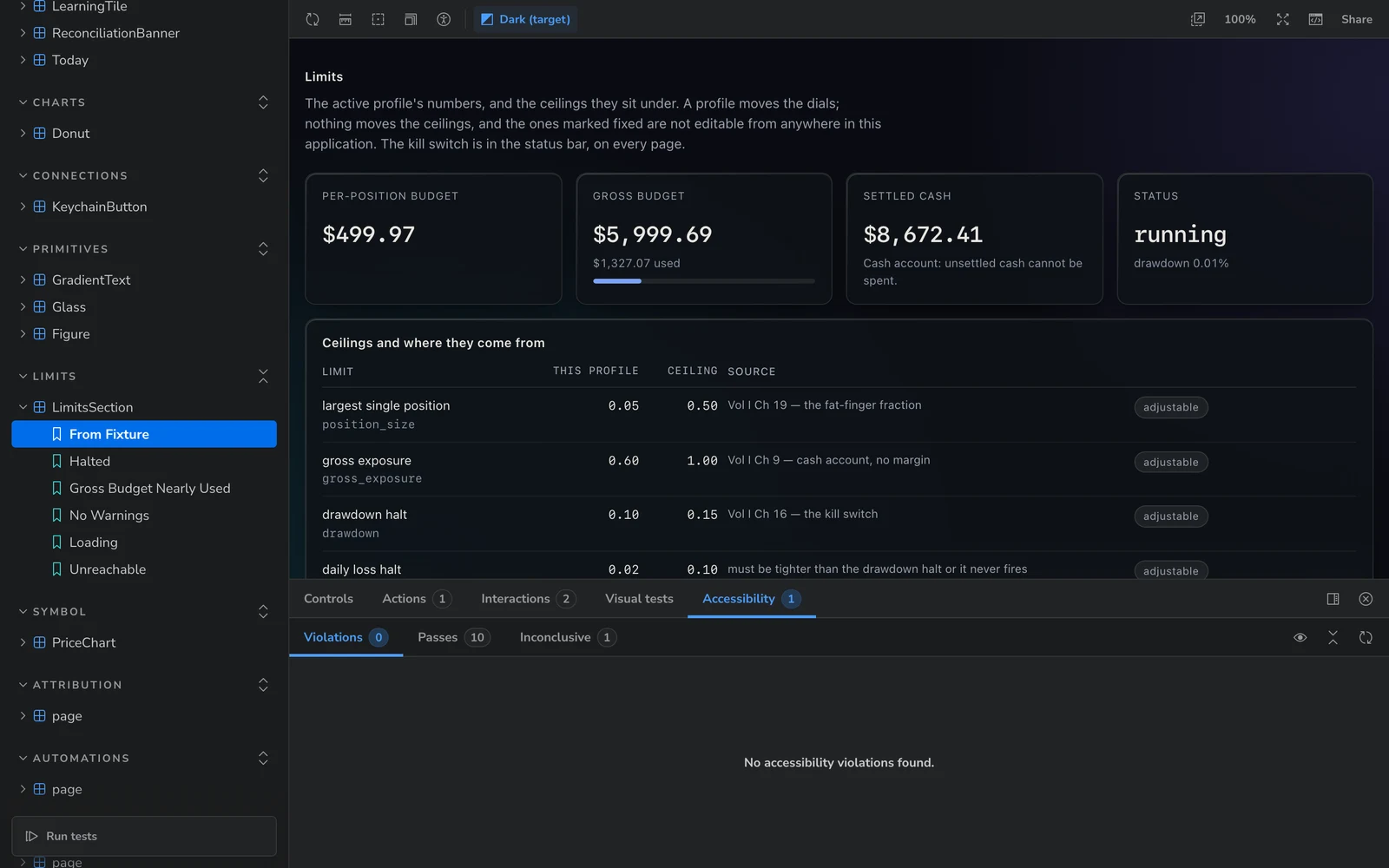
Look at the sidebar in any of these screenshots. Confirm Refused. Stop Asks Twice. Save Refused. Cancel Sends Nothing. Kill Switch Set Without Reason. Those aren't test names. They're sentences a designer, a developer, a PM and an agent can all use to mean the same thing.
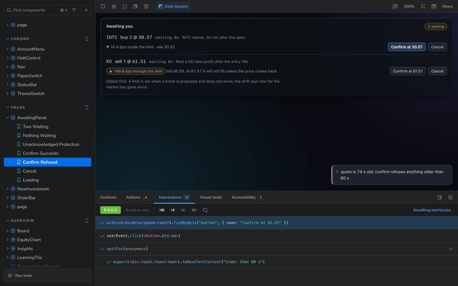
This is the part I'd push hardest on with a team. When a designer says "what happens if confirm fails?", the answer shouldn't be a Slack thread. It should be a link to a story called Confirm Refused, rendered with real data, with a test that proves it behaves the way the design says. stories-preview makes that link one call away, so the agent can drop it straight into a PR description or a review comment.
Name stories after the situation the user is in, not the props you set. Gross Budget Nearly Used tells a reviewer why the story exists. WithHighValue doesn't.
Reading the results without fooling yourself
This is where I'd slow a team down, because the output looks more certain than it is. Three things happened to me, and each one is a habit worth building.
1. Check which Storybook you're talking to
I asked the agent to run the dashboard's tests through the MCP. It came back with a list of passing stories and a handful of colour-contrast problems in a ContactForm, a WorkGrid and a BlogCard. The dashboard has none of those components. They belong to this website.
Both projects run Storybook on port 6006. This site's Storybook was already up, so the dashboard's MCP config, pointing at localhost:6006/mcp, was quietly talking to the wrong one. Earlier, the same mix-up had shown up as "no story found" for stories that definitely existed. The tool wasn't broken. It was answering a different question than the one I asked.
The fix is boring: give each project its own port, or stop one Storybook before starting the other. The habit is the useful part. Before you trust a result, check that the component names in it are yours. Ten seconds of reading would've caught it.
2. "Pass" might mean "not checked"
All 167 stories pass. That's true, and it's also not the same as "accessible." The Storybook preview had the accessibility test mode set to 'todo', which reports violations in the panel but doesn't fail the story. A green run with 'todo' means the interactions work. It says nothing about the axe results.
Which mode you pick is a team decision, not a config detail. 'todo' is right while you're working through a backlog of known issues, so the run doesn't go red on day one. 'error' is right once you've decided accessibility regressions block a merge. Write down which one you're on and when you plan to switch, or a green badge will mean something different to everyone who reads it.
Then I got caught by a second layer of the same thing. I ran the suite from Storybook's testing panel in the browser, and all 167 came back green. But the accessibility summary in that panel was empty. The panel has its own Accessibility checkbox, separate from the config, and it was off. That run hadn't scanned anything. Tick the box, run again, and the same 167 stories still passed their interaction tests while 24 of them showed accessibility warnings. Same code, same stories, a very different answer.
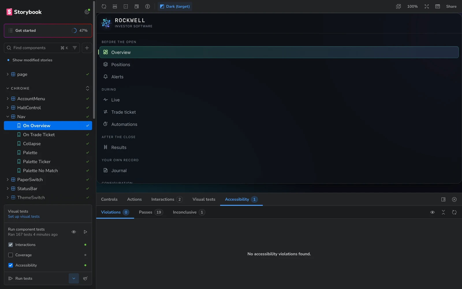
So when someone says "Storybook's green," ask two questions: was the accessibility scan on, and was it set to fail anything?
3. Read the violation, not the count
The accessibility panel gives you a number, and the number is the least useful part. Here's the account chip in the dashboard's header:
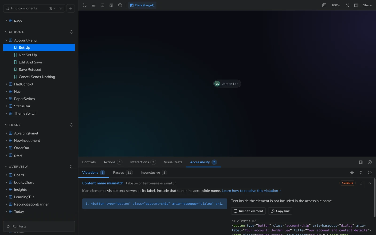
One violation sounds minor. Read it and it's a real user who can't operate the control by voice. The same rule flagged the Refresh button (it shows "↻ refresh R", its name is just "Refresh") and the brand link. There are two fixes: drop the aria-label and let the visible text be the name, or reword the label so it contains the visible text. That's a design choice about what the control should say, so I didn't let the agent pick. It listed the options and left them with me. When I came back and told it to fix the lot, I went with the first option: the chip's name now comes from its own visible text plus a hidden ", your account". The brand link turned out to have a sillier problem: its name read "RockwellInvestor Software", missing a space, because two pieces of text were run together.
Two other findings were clear-cut, and the agent fixed them in the same pass. A sort control had aria-sort on the <button>, where ARIA doesn't allow it; it moved to the table header, and the button kept a data-sort attribute for styling. And the Limits table had a column with no header at all, which now has one that only screen readers announce.
'todo' note above, this one actually means what it says.The second run: 24 warnings, and the ones nobody flagged
With the accessibility scan actually on, the 24 warnings broke down into a handful of rules repeated across pages: the Overview, Attribution, Automations, Changelog and Trade pages, plus the account menu, nav, status bar and Today panel. Rather than click through 24 stories in the browser, I had the agent pull the full axe report from a command-line run, which names the exact element every time. Here's what was in it and how each one got fixed:
- Names that didn't match the label. The account chip and the Refresh button, from above. Refresh now hides the ↻ glyph and the "R" key hint from screen readers, so its name is just the word "refresh", and it declares the shortcut properly with
aria-keyshortcuts. On phones the word used to be removed entirely, which left the button with no name at all. Now it's hidden visually instead. - A link marked by colour alone. A "Holding AAPL, KO, WMT →" link sat inside running text with nothing but colour to set it apart. It gets a quiet underline now.
- Empty table headers. More of the same problem as the Limits table. The agent didn't stop at the ones the stories flagged. It searched the codebase for the pattern and found 14 empty headers across 10 pages, more than any story had caught, and gave each one a hidden name like "Actions" or "Adjust".
- A report you couldn't scroll by keyboard. The daily report sits in a scrollable box that keyboard users couldn't reach. It's focusable and labelled now.
- A skipped heading level. The changelog went straight from
h1toh3. Release titles areh2now and look exactly the same. - Low-contrast nav marks. The "II" and "III" marks in the collapsed sidebar came in under the 4.5:1 minimum. Removing an extra opacity fixed it. That's the one change you can actually see.
Two lessons from this round. First, fix the pattern, not the instance. A story only checks the screen it renders. If one table has an empty header, search for the rest, because the stories won't find them all.
Second, six stories broke when the names were fixed, because their tests looked up the account chip and the Refresh button by their old accessible names. That's not a nuisance. It means the tests find controls the way a screen reader does, so changing what a control is called shows up as a failing test. That's what you want.
Then I asked for one more pass, and it turned up three things worth knowing.
- Sixty-eight buttons with the same name. Every
?help button on the dashboard was called "What this means". Axe doesn't flag that, because each one technically has a name. But a screen-reader user tabbing through a page hears "What this means" over and over with no idea which term it explains. Each one is now named after its term ("More about Drawdown"), and the explanation is read out when the button gets focus. - A fix that caused a violation. The label added to the daily report box in the previous round isn't allowed on a plain
<pre>. The next run caught it, and giving the box a region role fixed it properly. This is the case for re-running after every fix, even the obvious ones. - Nearly 1,900 "inconclusive" results. The Accessibility panel has three tabs, and "Inconclusive" is the one people skip. Almost all of these were colour-contrast checks on text sitting over the dashboard's frosted-glass panels, which axe can't see through, so it can't measure them. Inconclusive doesn't mean it passed, and it doesn't mean it failed. It means nobody has checked yet. Contrast there has to be checked by eye or with a separate tool, and the team should know that's the deal.
After all that, the whole thing is green with the accessibility scan on: 167 stories, plus the dashboard's 150 unit tests, 317 in all, with no violations. It shipped as dashboard version 0.23.1, which the changelog calls "Readable without a mouse or a screen". You can see it on the live changelog.
The best findings weren't test failures
This surprised me. The most valuable output of the whole exercise didn't come from test-run. It came from the agent having to describe every state of every component in enough detail to write a story for it. When I asked what UI changes I should review, it came back with a ranked list, and none of the top items were failing tests:
- Refusals that vanish. The design system has a rule that a toast never replaces an inline message, because the thing you missed might be a refusal. Five controls break it. Confirm, Halt, Paper start/stop, the Keychain button and Account save tell you about a refusal only in a toast, which disappears after nine seconds. Look away and nothing on screen says your confirm was refused. You can see the exact case in the Confirm Refused screenshot above.
- Information hiding in a tooltip. When Stop is refused because orders are still open, those orders are listed only in the button's
title. Keyboard and touch users can't open that, and it's gone the moment focus moves. - A gauge that rounds the truth. It caps at 100%, so a figure at 140% of its limit reads as exactly full, visually and to a screen reader.
- A button that disables without saying why. The walkthrough's Next button greys out when your reason is under 24 characters, and the minimum isn't written anywhere you can see. It just looks broken.
- A danger colour used for everyday things. Every fixed ceiling in the limits table carries a chip in the halt red, so the colour meant to signal "stop" showed up all over a perfectly normal screen.
The accessibility fixes have shipped. These haven't yet. They're the next round of work, and each one is a design decision before it's a code change.
None of those would show up in a design review of static frames, because static frames only show the states somebody thought to draw. Writing a story for every state forces the question "what does this look like when it goes wrong?", and the answer is often "we never decided." That's the real argument for doing this with a team. The story file becomes the place where undecided states get noticed.
How I'd run it with a UI team
If I were rolling this out on a team tomorrow, here's what I'd set up:
- Stories before the agent. Don't point an agent at an empty Storybook and call it integrated. Cover the components people actually reuse, with every state named in plain language.
- Mocks that fail loudly. Mock at the network edge, and make any unmocked write an error. A story that fakes success teaches the whole team the wrong thing.
- Put the "why" in the story. My stories carry a one-line comment pointing at the section of the spec that requires the behaviour: why the reconciliation banner can't be collapsed, why a stale quote is refused. A reviewer, or an agent, can trace a behaviour back to a decision instead of guessing.
- Preview links in every UI pull request. Make
stories-previewpart of the agent's routine so every change that touches the UI comes with links a designer can click without checking out a branch. - Agree on the accessibility gate. Start on
'todo', burn the list down, then flip to'error'on a date the team agrees to. Put the date somewhere people will see it. And make sure the Accessibility box in the testing panel is ticked, or the scan isn't running at all. - Let the agent fix the unambiguous, and route the rest. Invalid ARIA is a bug, so fix it. "What should this button be called?" is a design question, so it goes to a person with the options laid out.
- One port per project. Seriously. Or at least have the agent confirm the component names in a result before reporting it.
A few setup snags, so you don't hit them
- TypeScript skips dot-folders. The
**/*include patterns intsconfig.jsondon't match folders that start with a dot, so.storybook/was never type-checked. The tell was "cannot find module" errors on the CSS imports inpreview.tsx. Adding.storybook/**/*.tsand.tsxtoincludefixed it, and it means those files are actually checked now. - A test run that hangs halfway. Vite was re-optimising
next/linkandnext/navigationpartway through the run. Pre-bundling them in the Vitest config fixed it. - None of it ships. Storybook and its addons are dev dependencies. The production build of the dashboard went out in 17 seconds with nothing from Storybook in it.
Where this leaves me
I went in expecting a faster way for an agent to write components that match the library. I got that. The prop hallucinations stopped, because the agent checks the docs before it uses anything. But the bigger win was having one place where design intent, real behaviour and test results sit together, readable by the designer, the developer and the agent at the same time.
Just read the results like a reviewer, not a scoreboard. Check whose components they are, check what "pass" was actually measuring, and read the violation before you count it. The tool is honest. It answers exactly the question it was asked, so make sure that's the question you meant.
If you're setting up Storybook MCP on your own team and want a second pair of eyes, get in touch. Happy to compare notes.