OrbitGuard Ops
A collision-avoidance console for small-satellite operators — where the design problem is a decision under a deadline, not a dashboard.
- Engagement
- Self-initiated spec project
- Role
- Product Design & Front-End
- Platform
- Web console, 360px → ultrawide
- Domain
- Space situational awareness
- Scope
- 13 screens, 5 record types
- Build
- Next.js, prerendered static
Interactive prototype — best viewed on desktopInteractive prototype — click to try it
A small-satellite operator flying four to twelve spacecraft receives conjunction data messages from several tracking networks, each on its own cadence. The operator's job is not to read probabilities — it is to decide, before a hard deadline, whether to spend fuel. Three things make that hard, and none of them are solved by a table of numbers: the estimate is not stable, the decision expires before the event does, and a burn is never local. OrbitGuard Ops is a console designed around those three facts.
Reading an estimate that is still moving.
Probability of collision routinely moves two orders of magnitude in the 72 hours before closest approach, as new tracking data narrows the covariance. A single Pc value with no history is close to meaningless. The analyst needs to see whether a number is rising, decaying, or still too uncertain to act on — for seven events at once, without clicking.
- Key jobs
- Triage, Judge, Escalate
- Session
- Multi-hour, one screen
- Differentiator
- Trajectory over value
Every Pc Ships With Its History
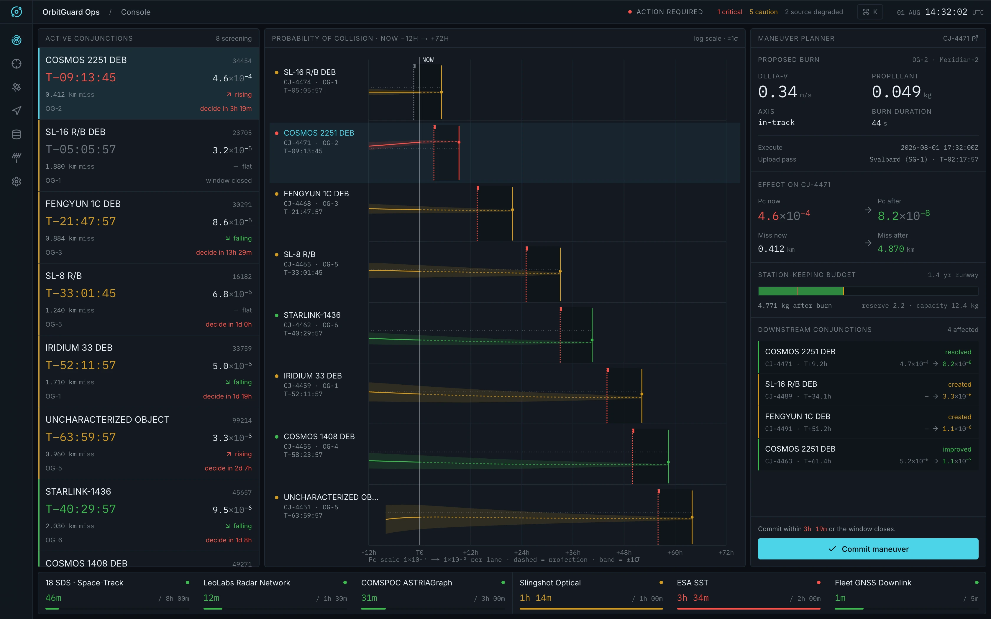
The console's centre is a shared UTC time axis from now −12h to now +72h, with each conjunction in its own lane terminating at its closest approach. The observed segment is solid, the projection dashed. Comparing two events is a glance down the screen, not a navigation task.
Uncertainty Is Drawn, Not Annotated
Confidence is a ±1σ band with real width rather than a ± suffix on a numeral. The band is widest at first screening and narrows toward closest approach as tracking accumulates — so a soft estimate is visually loud in exactly the way a soft estimate should be, and the reader watches it tighten.
A Log Scale, Because The Data Is Logarithmic
Pc is plotted from 1×10⁻⁷ to 1×10⁻² per lane with a dotted reference line at the 1×10⁻⁴ action threshold. A linear axis would flatten every sub-threshold event into the floor and hide precisely the movement the analyst is being paid to notice.
Color Carries State And Nothing Else
Green, amber, and red never decorate. If an element is red the operator must act on it. The interactive accent — a desaturated cyan — is reserved for selection and focus, never appears in a chart series, and never indicates severity, so the two languages can't be confused at speed.
Committing a burn that is never local.
Spending delta-v moves the spacecraft onto a new trajectory that re-screens against the entire catalogue. Resolving one conjunction frequently creates another, and every burn draws down a station-keeping budget that has to last the mission. The director arrives at a specific event with minutes to spend, and needs the full cost visible without leaving the screen.
- Key jobs
- Approve, Decline, Budget
- Session
- Minutes, decision-focused
- Differentiator
- Downstream cost inline
Downstream Conjunctions Sit Beside The Commit Control
The planner lists every event the burn would resolve, create, or worsen, each with Pc before and after. It is the panel's most important content and the reason a burn is never evaluated alone — one proposed 0.34 m/s burn resolves its event but creates two more.
The Deadline Is A Wall
A burn needs command upload, a ground-station pass, and propagation lead time, so the last viable moment to commit is hours before closest approach. Deadline markers are drawn at the same weight as the events themselves; past the marker the lane's remaining interval is recessed and the commit control disables.
Fuel As A Depleting Runway, Not A Number
The station-keeping budget is a bar showing propellant remaining, the segment this burn consumes, and the mission reserve — and it goes critical when a burn crosses into reserve. A director reads 1.4 years of runway rather than converting kilograms in their head.
Lead Time Is Worth More Than Delta-V
An in-track burn doesn't move the spacecraft when it fires; it changes the period, and separation accumulates linearly. The maneuver detail states this in the interface — the same burn an hour later is worth proportionally less — because it is the reason the deadline, not the fuel, is the real constraint.
Trusting the inputs before trusting the screen.
Every number on the console is downstream of a tracking network that may or may not be current. A console that renders a stale estimate identically to a fresh one is worse than no console. The engineer's session is a glance, repeated — so freshness had to be legible without opening anything.
- Key jobs
- Verify, Monitor, Weight
- Session
- Glance, recurring
- Differentiator
- Age against cadence
Freshness Is Relative, Not Absolute
Each network's status derives from its age against its own expected cadence, not against a wall clock. A radar network 46 minutes old on an 8-hour cadence is nominal; an optical network 1h 14m old on a 1-hour cadence is not. A single absolute threshold would have mislabelled both.
A Permanent Strip, Not An Alert
Source health occupies a fixed 72px strip across the bottom of the console rather than surfacing as a notification. Degradation is a slow, continuous condition; making the operator wait for an interruption to learn about it inverts the failure mode.
Sensor Type Explains The Estimate
Each source's detail page says what kind of sensor it is and what that implies — radar range-rate constrains the along-track component directly, which is the axis that dominates conjunction covariance. The engineer learns why one network's estimates are tighter, not merely that they are.
Wide Bands Get A Stated Reason
An uncharacterized object's page says plainly that its area-to-mass ratio is unmodelled. That is the reason its Pc carries a wide band, and naming it turns an unexplained wide band into a known limitation the operator can weigh.
Monitoring from a phone.
Conjunction assessment runs continuously, but an operator is not always at the console. The requirement was a phone that answers the questions worth interrupting someone for — is anything critical, has a deadline moved, are the sources still current — without becoming a second, weaker product. I audited the build across the breakpoint ladder rather than asserting it from a mockup, and the section below reports what that audit measured, including what it found missing.
- Range
- 360px → ultrawide
- Audited
- 7 widths, measured
- Known gap
- Touch target tuning
The Same Console, Not A Cut-Down One
Below xl the three panes become a segmented control rather than disappearing, and selection carries across — choosing an event in the queue leaves it selected in the planner. The phone loses simultaneity, which a phone cannot have, but it loses no information and no capability.
Type Does Not Scale Down
Measured across seven widths from 1680px to 360px, the rendered type scale is identical — the 11px axis label is 11px on a phone. Charts draw in real pixels against a measured container rather than scaling a fixed viewBox, so a narrow screen buys less time resolution, never smaller text.
Charts Re-Draw Rather Than Shrink
Below ~760px the timeline moves its lane labels out of the left gutter into a header row inside a taller lane, handing the full width back to the plot. Below ~640px the campaign chart drops to three decade gridlines and four hour ticks. The chart sheds resolution deliberately instead of compressing.
Nothing Overflows At The 360px Floor
The audit found no horizontal document scroll at any width down to 360px. Dense tables scroll inside their own panel rather than pushing the page sideways — so the one gesture that reliably breaks a data-heavy layout on a phone never gets triggered by the shell.
The Status Strip Sheds In Priority Order
As width falls the top strip drops its caution and source counts but keeps the mission identity, the UTC clock, and ACTION REQUIRED. What survives to the narrowest width is the thing that would make an operator open the app at all.
Touch Tuning Is A Named Gap, Not A Claim
The layout is responsive to phone widths; hit targets are not tuned for touch. Measured at 390px the smallest interactive target is 30px — clearing WCAG 2.2's 24px AA minimum, but short of the 44px enhanced level on three of ten controls. Adequate for a glance, not yet for the gloved or one-handed use an operations product should assume.
Audited against the criteria.
Accessibility in an operations product is not a compliance errand — an operator who cannot read a countdown, or reach a control without a mouse, is an operator who misses a deadline. So rather than assert the console is accessible, I instrumented it and tested it against WCAG 2.2: sampling every text node for contrast, walking the tab order, and measuring every interactive target. Three criteria hold. One does not, and the audit is reported here with the failure in it.
- Standard
- WCAG 2.2, AA and AAA
- Sampled
- 190 text nodes, 19 controls
- Result
- 1 criterion failing
Keyboard Reaches Everything — 2.1.1, 2.4.7
All fourteen tab stops are reachable in order, every one carries a visible focus outline, and every control exposes an accessible name. The queue rows are real buttons rather than click handlers on divs, so selecting a conjunction — the console's primary action — never requires a pointer.
Colour Is Never The Only Signal — 1.4.1
The product's fourth principle is that colour carries state. That is a liability under Use of Colour unless the state is also readable without it, so every value colour encodes is also written as a word: rising, falling, flat, window closed, critical, caution. The strict colour language survives a reader who cannot distinguish it.
Contrast Is Where It Fails — 1.4.3
Of 190 sampled text nodes, 91 fall below the 4.5:1 AA threshold — and every one traces to a single token. The tertiary text colour renders 3.81:1 on panel and 4:1 on recessed panel, mostly at 11px. It clears the 3:1 bar for large text and non-text contrast, which is likely why it survived design review, and fails at the size it is actually used.
One Variable Is The Whole Fix
Because the palette is tokenised, that failure has one edit behind it: promoting tertiary text to the secondary value already in the system takes it to 5.7:1 on panel and 6.0:1 on recessed panel, clearing AA on both with room to spare. A finding worth reporting is one that resolves to an action, not a percentage.
Target Sizes Clear AA, Not AAA — 2.5.8, 2.5.5
At phone width no target falls under the 24px AA minimum, and three of ten sit under the 44px enhanced level. On desktop one 60×16 record link is the sole element beneath the AA threshold. Precise levels matter here: 'fails accessibility' and 'meets AA but not AAA' are different findings and lead to different work.
What The Audit Could Not Settle
The spec suppresses all motion under prefers-reduced-motion. I could not confirm that from outside the app — my instrumentation could not distinguish suppressed animation from animation already complete when sampled. It is reported as unverified rather than folded in as a pass, because an audit that only finds what it hoped to find is not an audit.
Built for the eight-hour shift.
All three roles look at the same screen at the same time — this is a shared operating picture, not a dashboard per role. That, plus sustained attention, set the constraints: nothing may shift, jitter, or decorate over the course of a shift, and density has to survive down to a phone.
- Grid
- 8px, 4px max radius
- Type
- Inter + IBM Plex Mono
- Records
- 5 cross-linked types
Tabular Numerals Everywhere
Every numeral, identifier, and timestamp is monospaced with tabular figures, so a live countdown ticking from T−09:13:45 doesn't reflow the row it sits in. Countdowns are deliberately the one element with no animation at all.
No Shadows, Glows, Or Gradients
Elevation is expressed with a surface value and a 1px border, and charts use flat 1.5px strokes with no rounded caps. Every removed effect is one less thing competing with the three colors that actually mean something.
Density Over Navigation
An operator should never click to compare two conjunctions. Whitespace separates functional groups; it does not pad rows. At full width the three panes scroll internally against a shell pinned to the viewport, so the frame never moves under a reader who is scanning it.
No Identifier Is A Dead End
Every row opens its own record and every detail page links the entities it names — a conjunction reaches its spacecraft, its catalogued secondary, its screening network, and any burns logged against it. A command palette indexes all five record types alongside the seven destinations.
Degrade Visibly, Including At 404
Historical burns reference conjunctions that have since cleared; rather than breaking, those degrade to the record itself and say so. An unresolved ID lands on a styled page that explains the scenario instead of a framework default.
Process
I started from the decision rather than the data: what does an operator have to be certain of before spending fuel, and what closes that window? Writing the product principles first — show the estimate's history, draw uncertainty, treat the deadline as a wall, let color carry only state, choose density over navigation — meant every later layout question had an answer that wasn't a matter of taste. I then built it as a working responsive prototype so the density claims could be tested at real viewport widths rather than asserted in a mockup.
Research methods
- Conjunction-assessment workflow and CDM cadence review
- Three operator profiles sharing one operating picture
- Orbital mechanics grounding — Gauss variational, Clohessy–Wiltshire, Tsiolkovsky
- Responsive audit across seven widths — type scale, overflow, and hit targets measured
Deliverables
- Product requirements document and design principles
- Design system: surfaces, five-step type scale, status language
- 13 screens across 5 cross-linked record types
- Breakpoint ladder from ultrawide to a 360px floor
- Working responsive front-end prototype
The console
13Responsive & mobile monitoring
13Next project
Hunter Water Management