From UX Feedback to Better Products
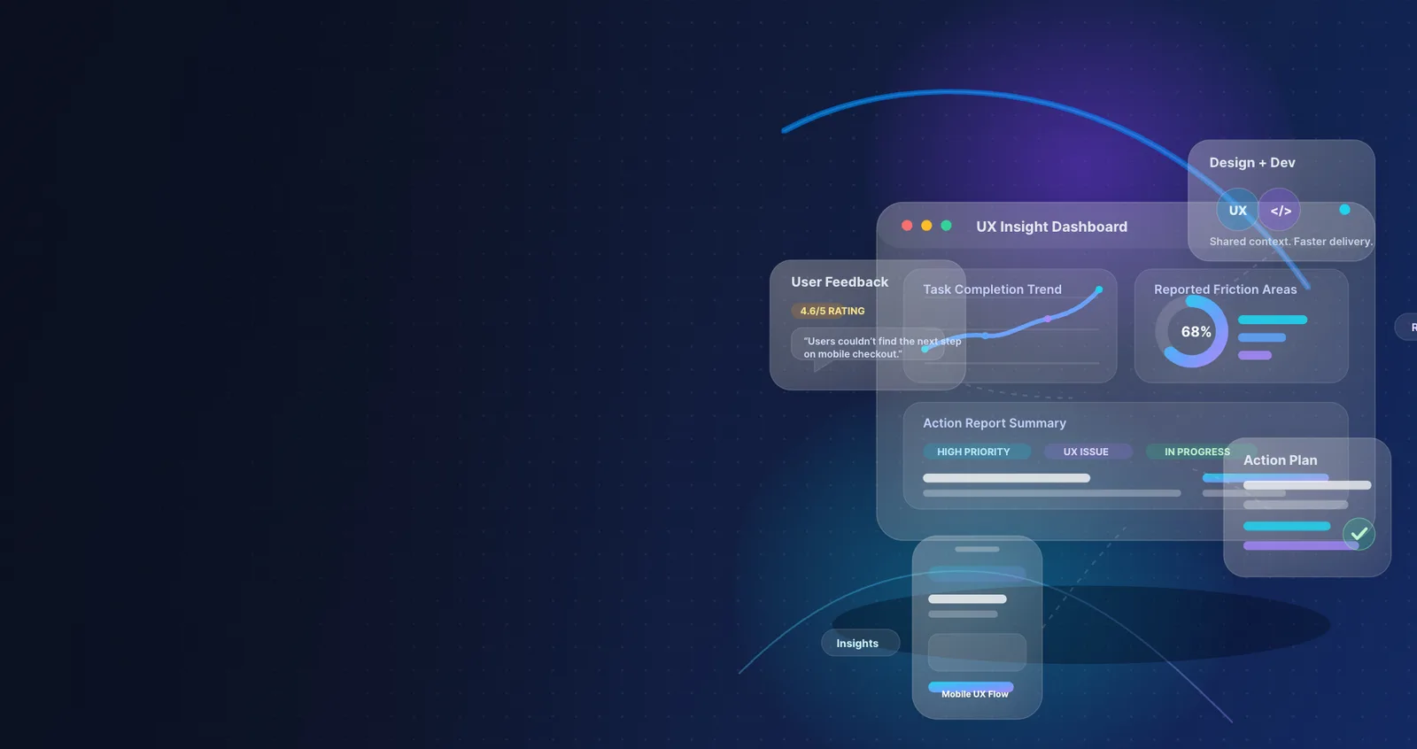
Great digital products rarely come from one brilliant design idea. Much more often they come out of a cycle: listen, test, refine, and keep talking clearly across teams. The best UI and UX work I've seen comes from organizations that know how to gather useful feedback from users, turn it into action, and get designers and developers lined up behind changes that genuinely improve the experience.
When that cycle works, the guesswork goes away. Designers stop working in a vacuum, developers get clearer requirements, and product teams make better calls. Most of all, users end up with something that feels intuitive and useful and doesn't get in their way.
This post covers how I'd gather UX feedback, turn what you learn into action reports, and communicate it to both the designers and the development team so the product comes out better.
Why UX feedback matters
UX feedback is more than a pile of opinions. It's direct evidence of how people experience your product: where they struggle, what they expect, and what stops them reaching their goals.
Without it, teams fall back on assumptions. "This layout is obvious." "Users will understand this button." "That form is simple enough." "This flow is probably fine." But people don't use a product the way the team assumes they will. They use it according to their own context, habits, expectations, and limits, and something that looks clear from the inside can be baffling from the outside.
Good feedback helps a team spot pain points early, cut down on user frustration, and improve conversion and retention. It lets you prioritize fixes by real impact, it improves collaboration between design and engineering, and it builds trust in product decisions. It also brings some objectivity into UX conversations. Instead of arguing about preferences, the team can get on with solving problems users have actually been seen to have.
Step 1: Gather UX feedback from multiple sources
The strongest UX decisions rest on both qualitative and quantitative feedback, and you really do need both. The numbers show what's happening. Conversations and observation show why.
1. Run usability tests
Usability testing is one of the most reliable ways I know to find friction. Watching someone attempt a real task often turns up problems analytics can't. Good tasks to test include signing up for an account, finding a product or feature, completing checkout, editing profile settings, and submitting a support request.
While they work, watch for:
- where they hesitate
- what they misunderstand
- which labels or buttons confuse them
- where they give up on a task
- what workarounds they invent on their own
Even five to eight users from a target segment can uncover major usability issues.
2. Use in-app surveys and feedback widgets
Short, targeted surveys catch feedback in context, while the experience is still fresh. Questions that tend to work:
- "What nearly stopped you from completing this task?"
- "Was anything confusing on this page?"
- "What would make this experience easier?"
- "How easy was it to complete your goal today?"
Keep them short and relevant. Long surveys wear people out, and the quality of the answers drops.
3. Review support tickets, reviews, and customer conversations
Support teams often sit on some of the clearest UX signals in the business. Users won't say "this is a UX problem," but their complaints frequently point straight at one. Look for patterns: questions that keep coming up, complaints about navigation, requests for clarification, frustration with onboarding or forms, reports of accessibility problems, and feature confusion that gets reported as a "bug."
Customer reviews and chat transcripts also surface emotional language, which tells you how strongly people feel about a problem.
4. Analyze product analytics
Behavioral data tells you how widespread an issue is. The metrics worth watching might include:
- drop-off rates in key flows
- click-through rates on calls to action
- rage clicks
- time on task
- form completion rates
- error rates
- funnel abandonment
- feature adoption
Session recordings and heatmaps add useful context too, especially next to usability testing.
5. Include internal stakeholder feedback, carefully
Designers, developers, QA, sales, and customer success all touch the product in different ways. What they tell you can be valuable, but it shouldn't outweigh what users tell you directly. Internal input is most useful for pointing at areas worth investigating. It's no substitute for actual research.
6. Don't forget accessibility feedback
A good product has to work for people with different abilities, so accessibility reviews, audits, and testing with people who rely on assistive technology are essential. Check keyboard navigation, color contrast, screen reader compatibility, focus states, form labeling, touch target size, and motion sensitivity.
Accessibility isn't an add-on. It's part of good UX.
Step 2: Organize feedback into clear themes
Once feedback starts coming in, the next job is keeping it from turning into chaos. Raw feedback is useful, but unorganized feedback becomes noise fast. What you want is a set of themes a team can act on.
Typical themes might be navigation confusion, unclear onboarding, form friction, visual hierarchy problems, mobile usability, accessibility blockers, features people can't find, and concerns about trust and credibility.
A simple tagging system helps. You might label every piece of feedback by:
- feature or screen
- user type
- severity
- frequency
- impact on a business goal
- where the feedback came from
That makes patterns easier to see, and it stops the loudest opinion in the room from running the conversation.
Step 3: Turn UX findings into action reports
An insight is only worth something once it leads to a clear next step, and that's what an action report is for. It turns user feedback into a structured document that design, development, and product can make decisions from. It takes the ambiguity out and makes sure everyone understands what the issue is, why it matters, and what happens next.
What a good UX action report includes
| Section | Purpose |
|---|---|
| Issue summary | A short description of the problem |
| Evidence | Quotes, recordings, analytics, screenshots, or test findings |
| User impact | How the issue affects users |
| Business impact | How it affects conversion, retention, support costs, or product goals |
| Recommended action | The proposed design or UX improvement |
| Priority | Urgency based on severity, frequency, and impact |
| Owner | The team or person responsible |
| Status | Open, in progress, planned, resolved, validated |
A sample UX action report
| Field | Example |
|---|---|
| Issue summary | Users are abandoning the registration form at the password creation step |
| Evidence | 38% drop-off rate on step 2, multiple support requests about password rules, 4 out of 6 test users failed on first attempt |
| User impact | Users become frustrated because password requirements appear only after submission |
| Business impact | Reduced sign-up completion and increased support burden |
| Recommended action | Show password requirements upfront and provide real-time validation |
| Priority | High |
| Owner | Design + Frontend Development |
| Status | Planned |
A report like this moves the team from "users are frustrated" to "here's the exact problem, the evidence, the impact, and the next action."
Prioritize properly
Not every UX issue needs fixing right now, so prioritization matters. A simple way to do it is to rate each issue on five things: severity (how damaging is it?), frequency (how often does it happen?), user impact (does it block people or just slow them down?), business impact (does it touch revenue, retention, trust, or support load?), and implementation effort (how complex is the fix?).
That lets the team start with the changes that make the biggest improvement for the clearest return.
Step 4: Communicate findings well to designers
Designers need more than a list of complaints. They need context, evidence, and clarity, so they can solve the right problem instead of responding to the feedback literally.
Share the problem, not just the requested fix
Users often describe what they think they want, and that isn't always the best fix. Someone says "make the button bigger." The real issue is that the call to action lacks visual prominence and is competing with secondary actions. Pass on the underlying problem, and let the designers explore the best way to solve it.
Use visuals wherever you can
Screenshots, annotated recordings, heatmaps, and journey maps help designers understand friction faster than text does. Before-and-after flow maps, marked-up UI screenshots, highlighted pain points, session replay clips, and wireframe suggestions tied to evidence all earn their place.
Frame feedback around goals
Good design decisions balance what users need with what the product is trying to do, so make sure designers know which outcome matters most. That might be reducing checkout abandonment, improving onboarding completion, making a feature easier to discover, or cutting support tickets about account settings. It gives them direction without dictating the answer.
Step 5: Communicate clearly with the development team
Even the best UX recommendation can fail if it's handed over vaguely. Developers need detail they can act on, not "make it more intuitive." From a UX report, they need:
- a clear description of the issue
- why it matters
- the behavior you want
- edge cases
- technical constraints or assumptions
- acceptance criteria
- supporting design files or prototypes
Write findings in implementation-ready language
Don't say "The form is confusing." Say "Move password requirements above the field, show inline validation as users type, and display error messages in plain language before form submission." The clearer the handoff, the fewer misunderstandings and revisions you'll have later.
Bring developers in early
One of the biggest mistakes I see is treating developers as the last step in the UX process. Bringing engineering in early produces better solutions, because developers can flag technical feasibility, faster alternatives, performance implications, accessibility considerations, and edge cases across devices and states. Design and development should start working together while the problem is still being framed, not once the designs are signed off.
Step 6: Build a shared feedback-to-delivery workflow
The strongest teams don't treat UX feedback as a one-off. They build a system they can repeat. A practical version might look like this:
- Collect feedback from research, analytics, support, and user sessions.
- Tag the findings and group them into themes.
- Back each issue up with evidence.
- Prioritize by impact and effort.
- Write the UX action reports.
- Review the reports with design, product, and engineering.
- Build the changes everyone agreed on.
- Test the updated experience.
- Measure the outcomes.
- Write down what you learned for future decisions.
A process like this keeps momentum going and makes every team accountable for its part.
Step 7: Close the loop after changes ship
UX work isn't finished when a design ships. It's finished when the change has been shown to work. After it's built, check whether the update actually improved things: less drop-off, fewer support tickets, higher task success, lower error rates, better satisfaction scores, better accessibility compliance, and stronger conversion or retention.
If the change worked, write down the result. If it didn't, go back to the problem and refine the fix. Closing the loop like this builds a habit of learning rather than assuming.
Common mistakes to avoid
- Collecting feedback with no clear objective. Collecting at random gives you messy, unfocused results. Start with a question or a goal.
- Treating all feedback equally. One isolated opinion shouldn't carry the same weight as an issue that keeps coming up and has evidence behind it.
- Confusing preferences with usability problems. Not every dislike points to a UX flaw. Look for patterns and for tasks people can't finish.
- Reporting findings without ranking them. A long, unranked list of issues overwhelms the team and delays action.
- Handing over vague recommendations. General feedback causes rework. Specific recommendations backed by evidence speed up delivery.
- Working in silos. Good UX depends on research, design, product, development, QA, and support talking to each other all the way through.
Final thoughts
A good UI and UX product doesn't come from design talent on its own, or from development speed on its own. It comes from teams that listen carefully, read feedback accurately, and communicate clearly across disciplines.
Gather feedback from the right sources, sort it into meaningful patterns, and turn it into reports people can act on, and you've got a process that turns insight into improvement. When designers and developers share the same understanding of the problem, they work together better and get to better solutions faster.
Better UX was never only about cleaner-looking interfaces. It's about helping people get what they came for with less friction, more confidence, and a real sense that the product was built with them in mind.